
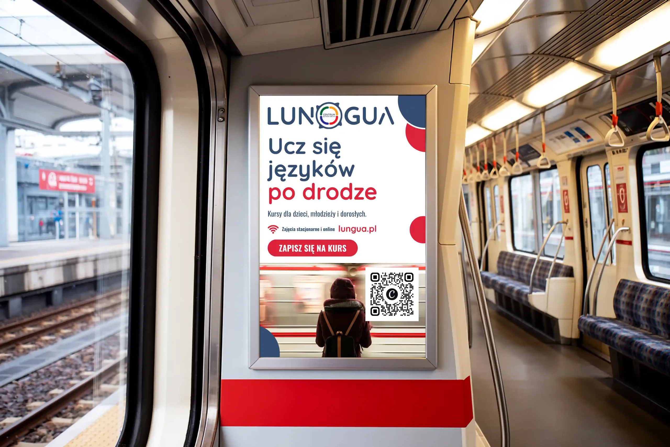
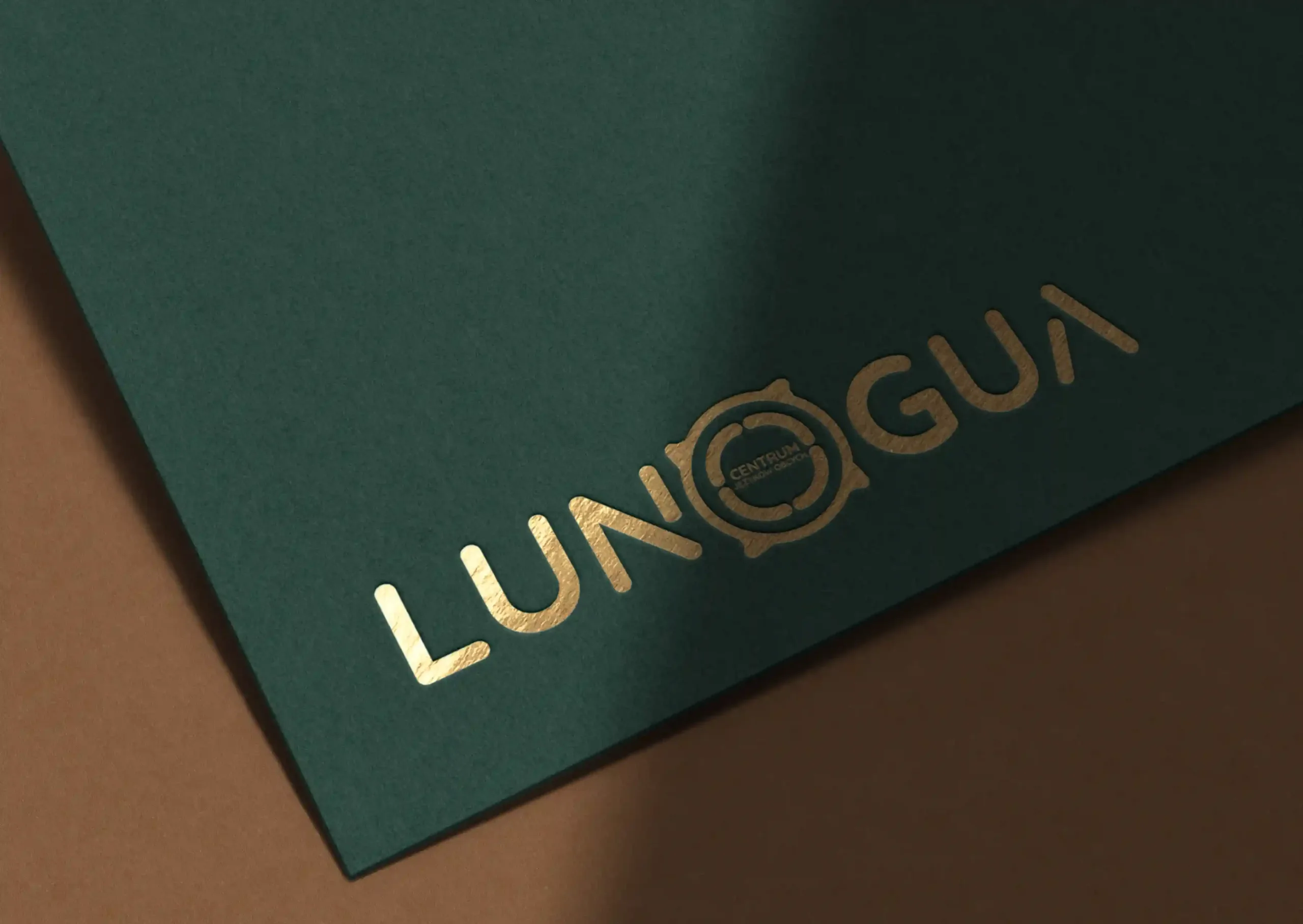
LUNGUA – visual identity for a modern foreign language centre.
01 / Challenge
Breaking out of the school cliché.
Visual communication in the language school sector relies on repetitive, dull patterns: literal country flags, globes and a stiff, academic atmosphere. The goal of LUNGUA was to create a brand with a soul – an open language immersion centre that, under the motto “Language opens the world”, brings together courses for children, teenagers, adults and businesses.
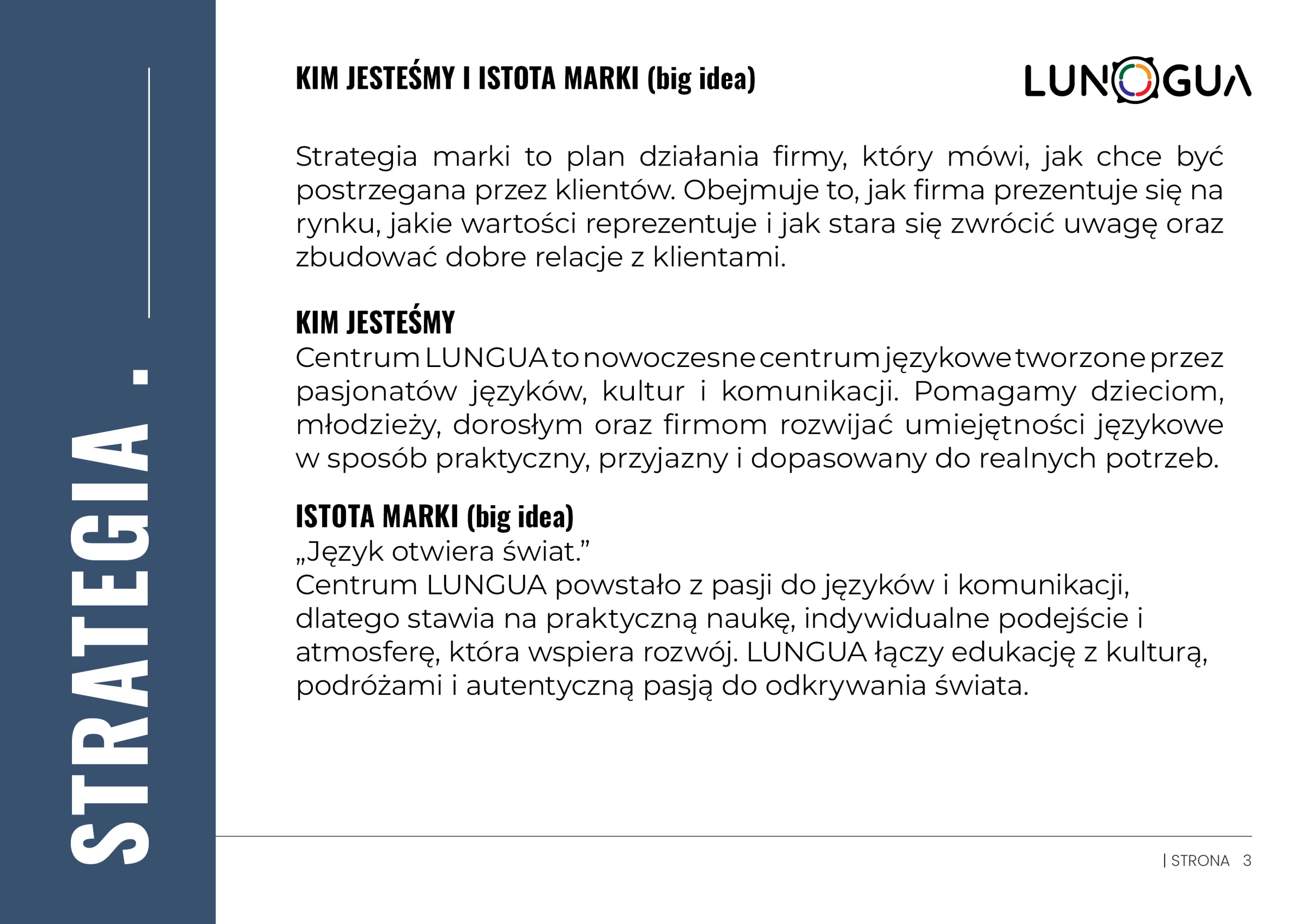
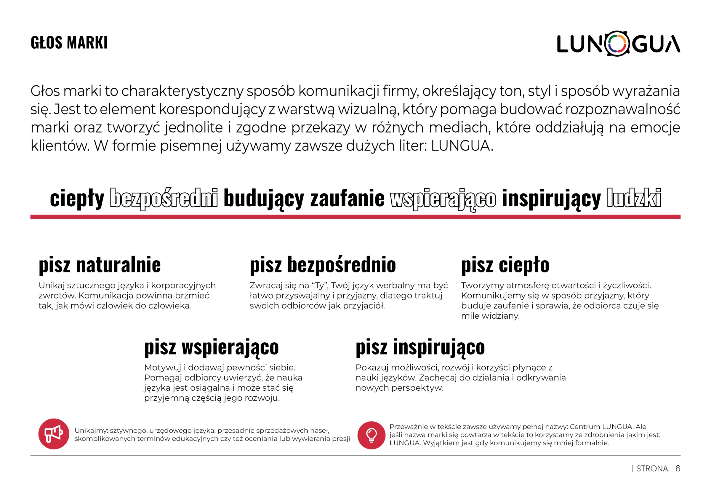
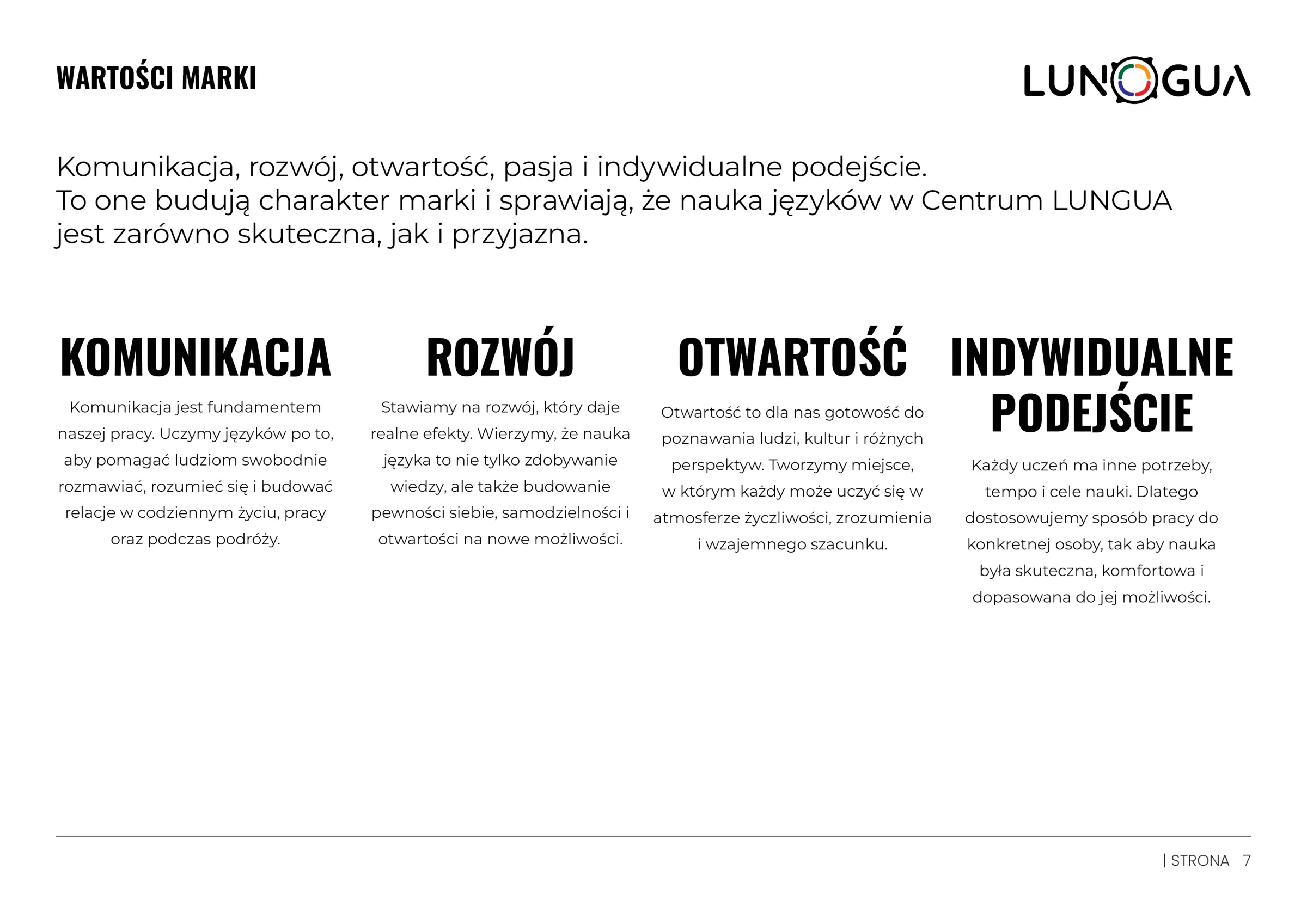
02 / Logo idea
Four skills instead of flags.
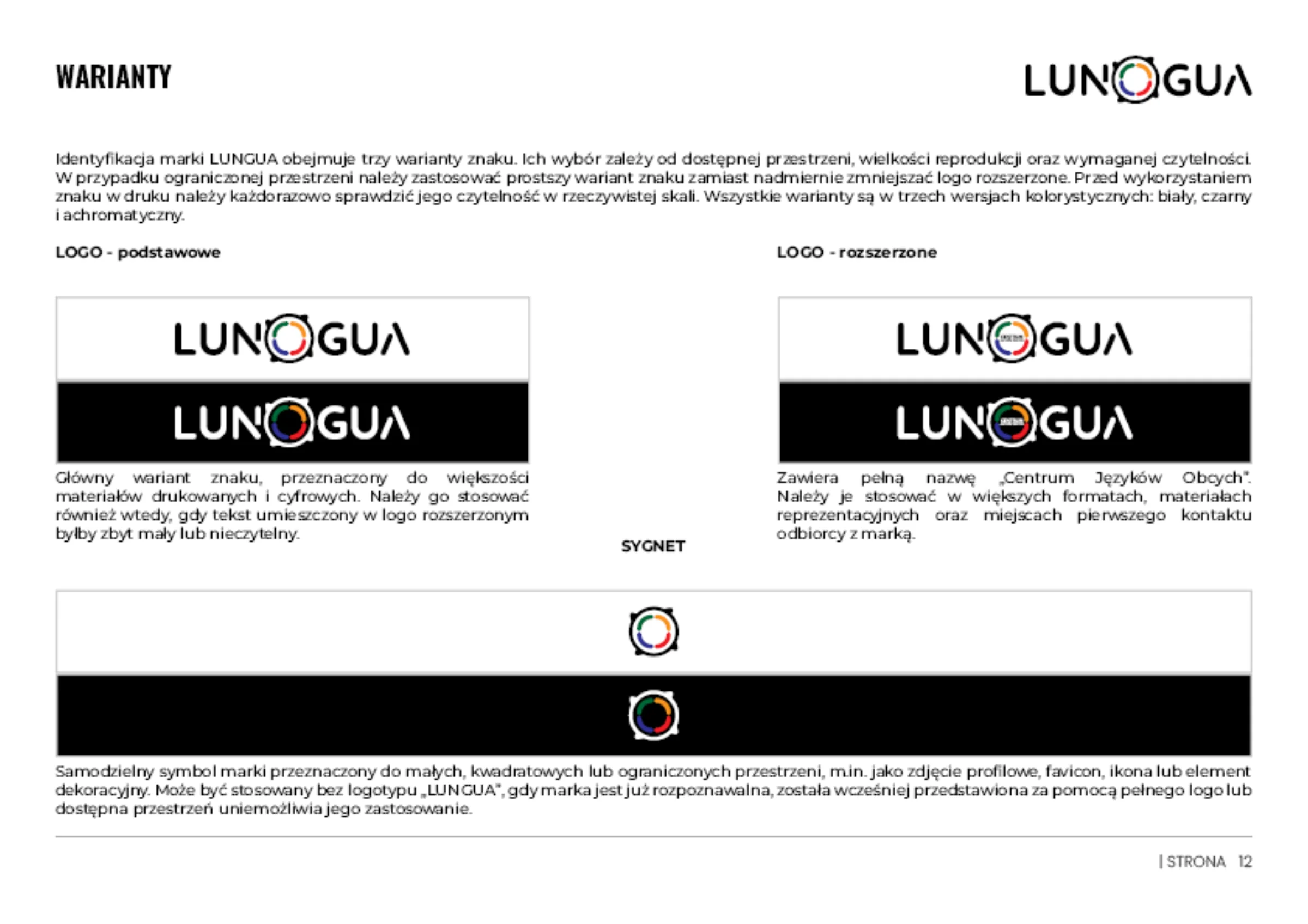
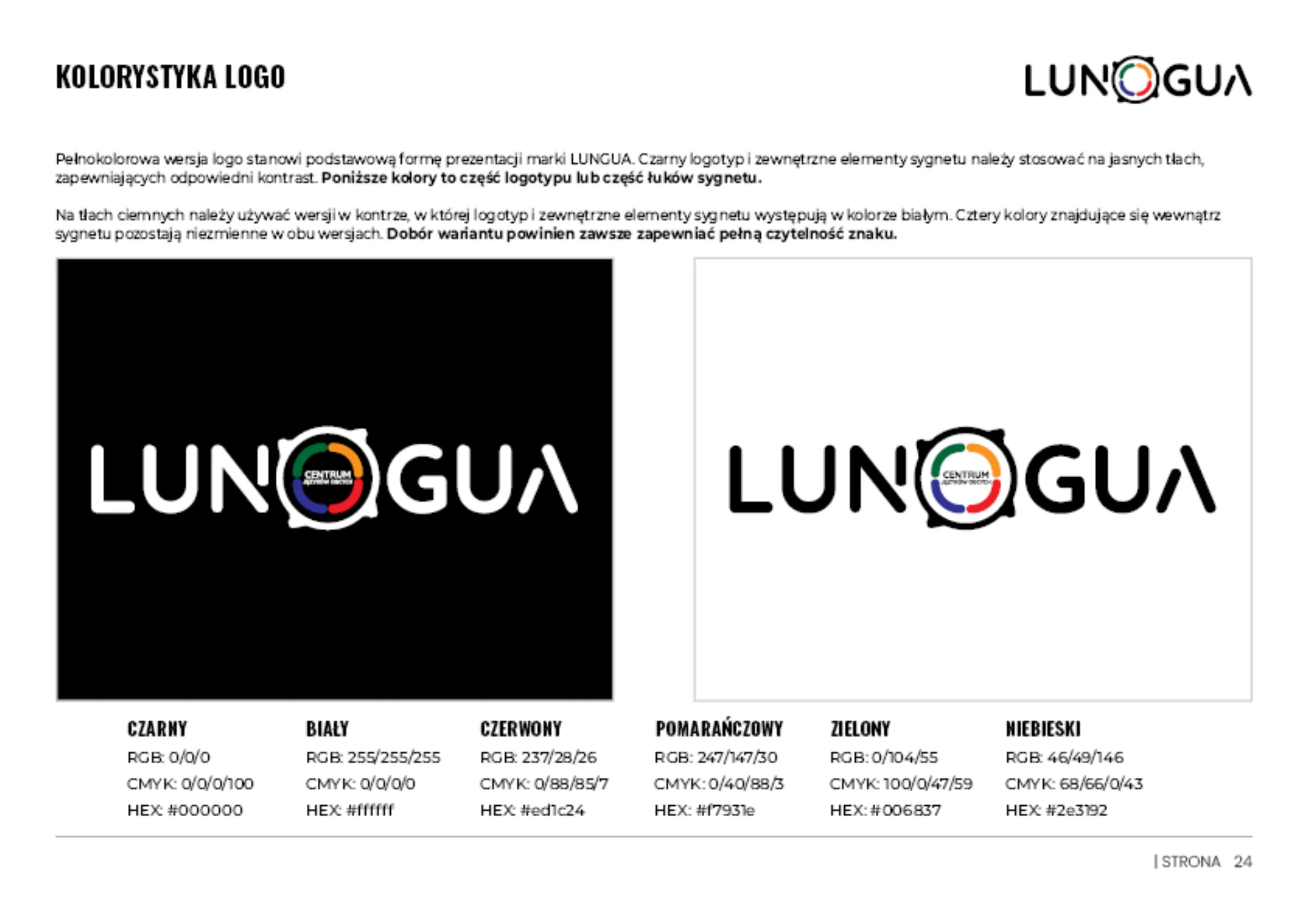
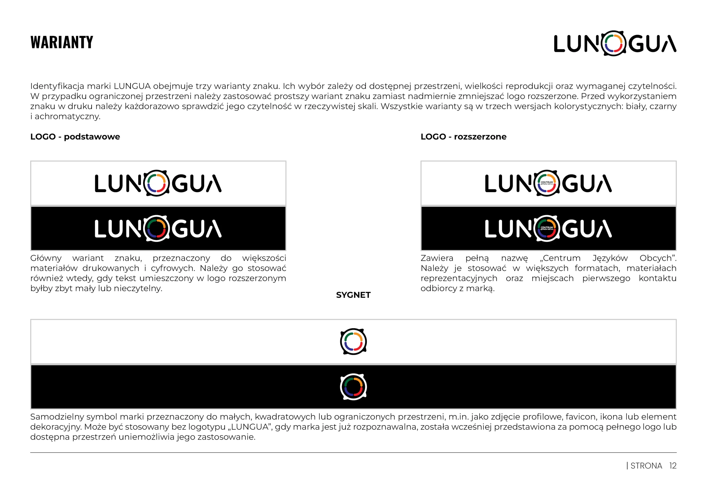
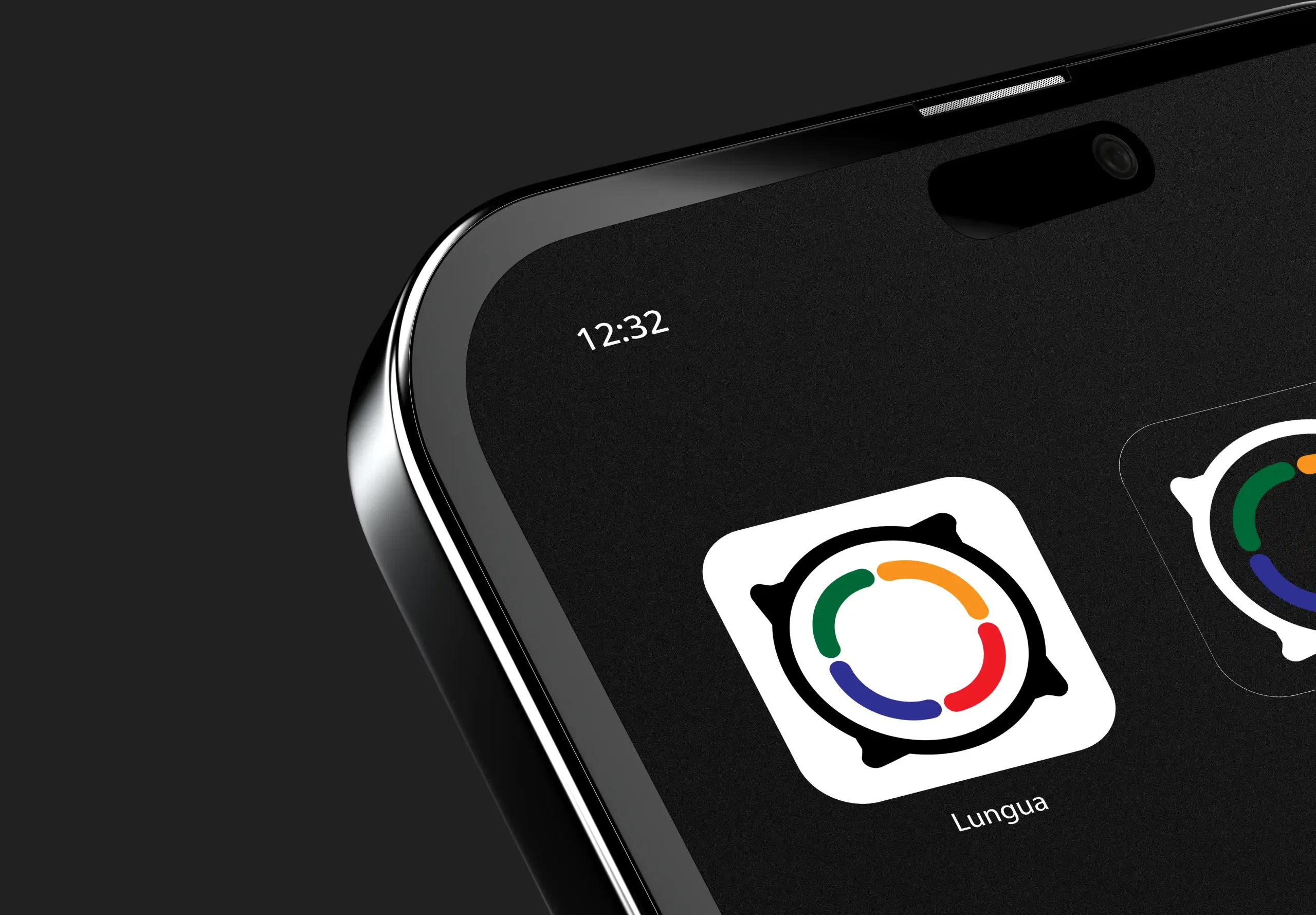
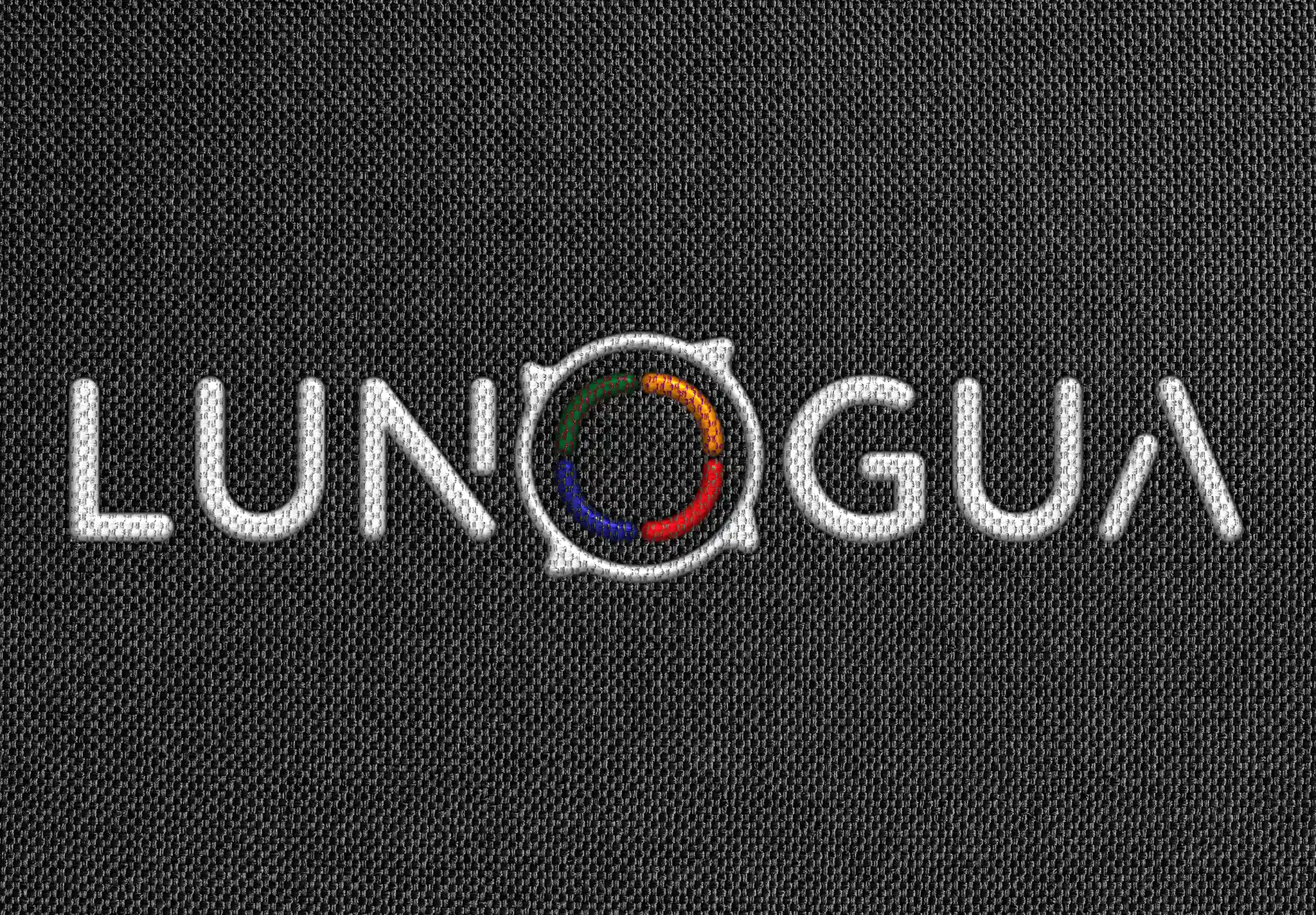
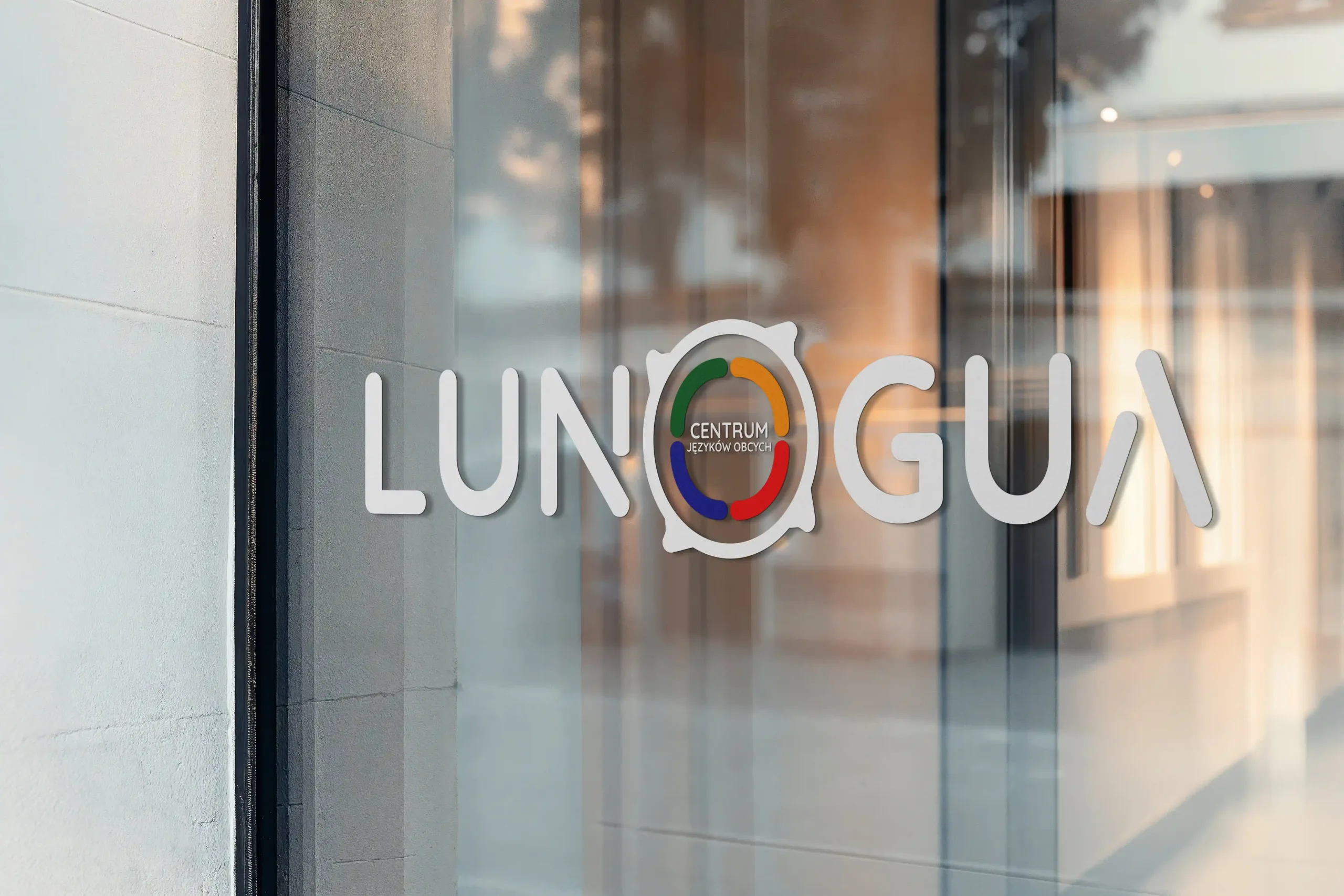
Instead of limiting the brand to the flags of specific countries, the LUNGUA symbol combines a speech bubble with a multicoloured circle. The four colours stand for the four pillars of learning any language: speaking, listening, reading and writing – giving the brand full freedom to add new languages.
03 / Construction
Mathematical precision at every scale.
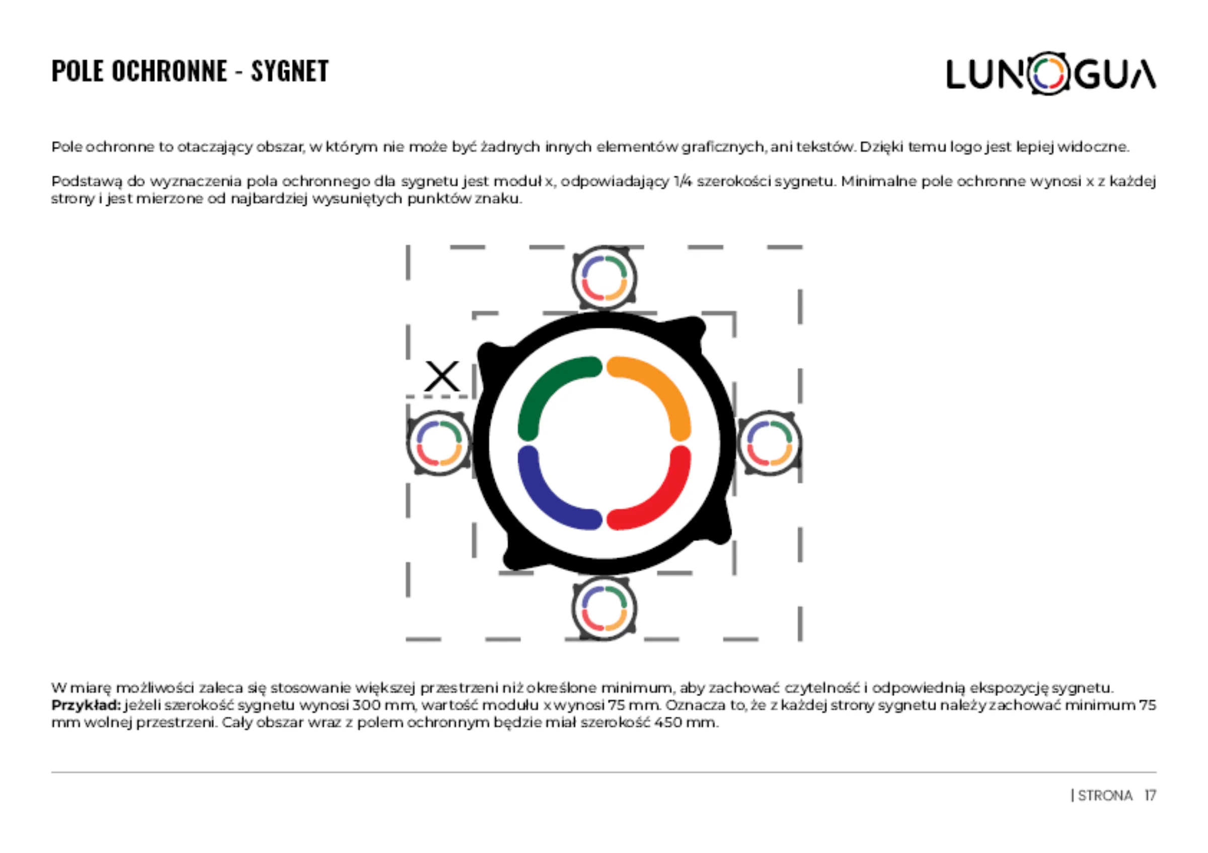
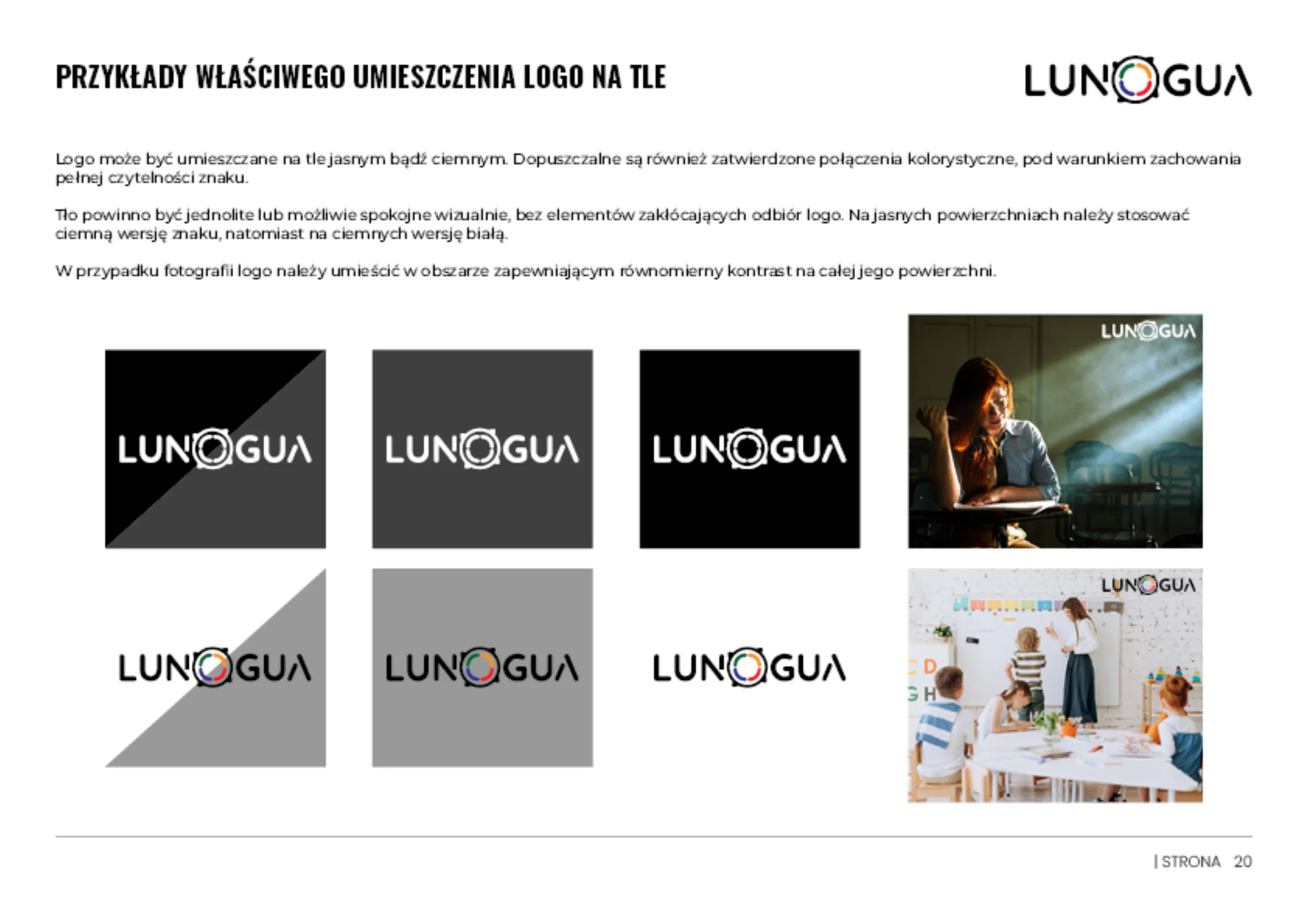
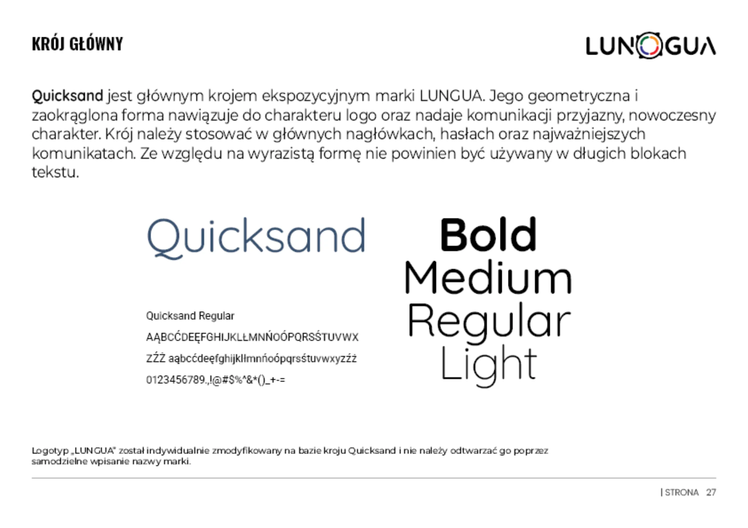
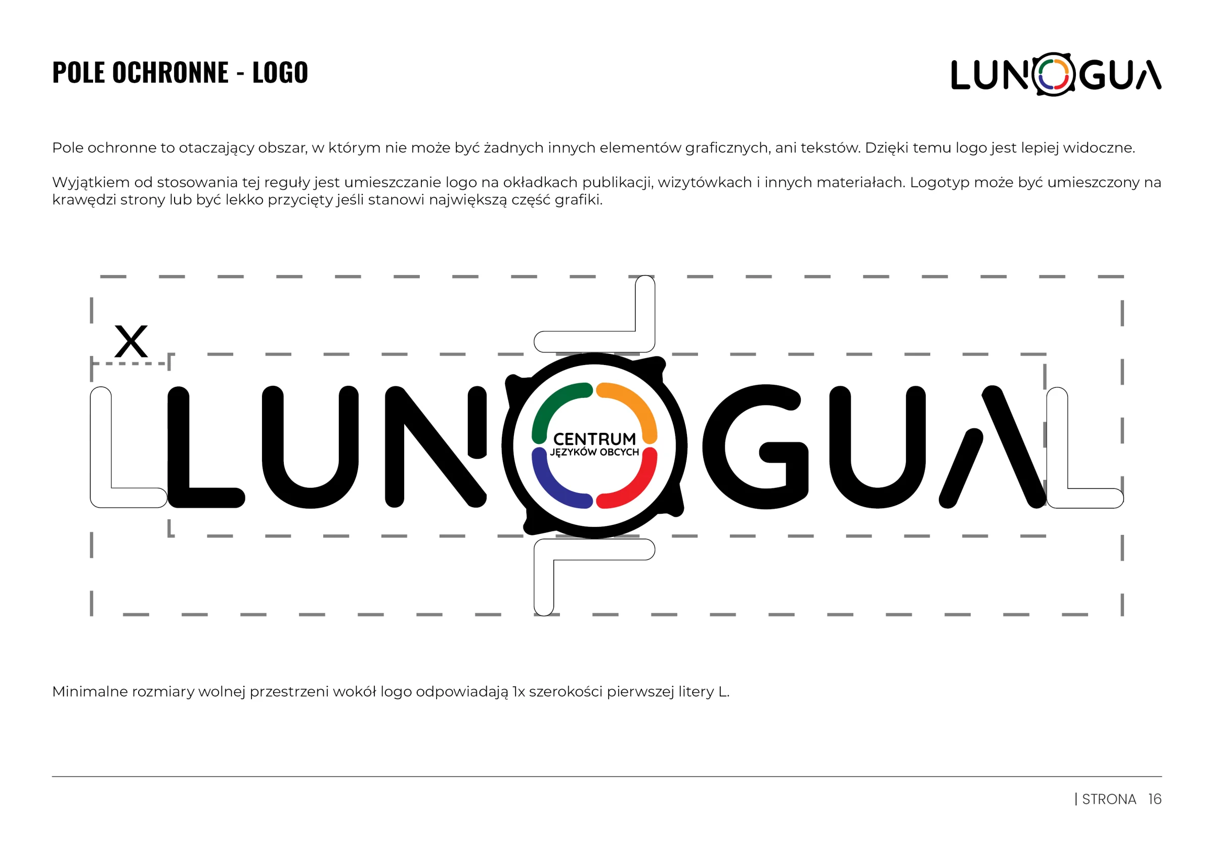
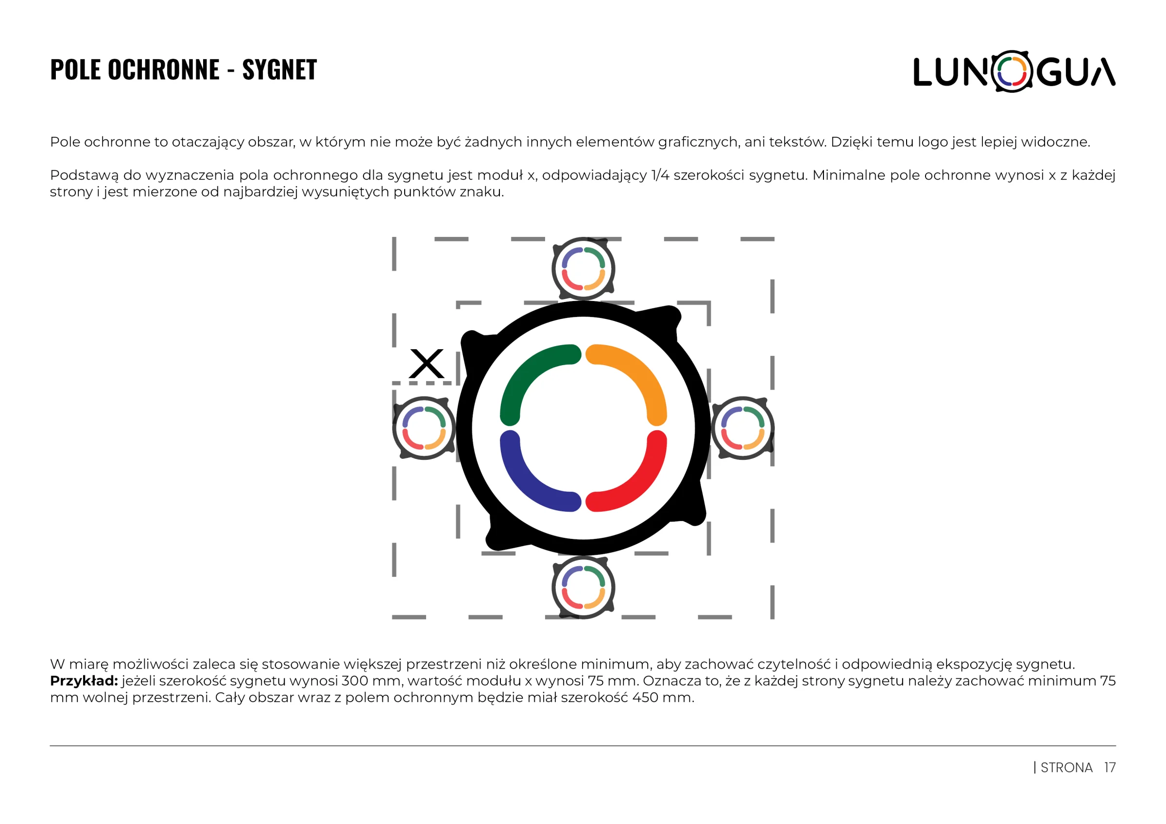
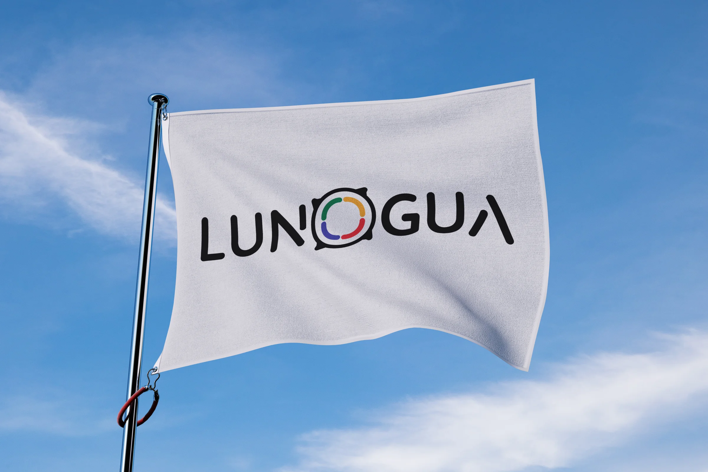
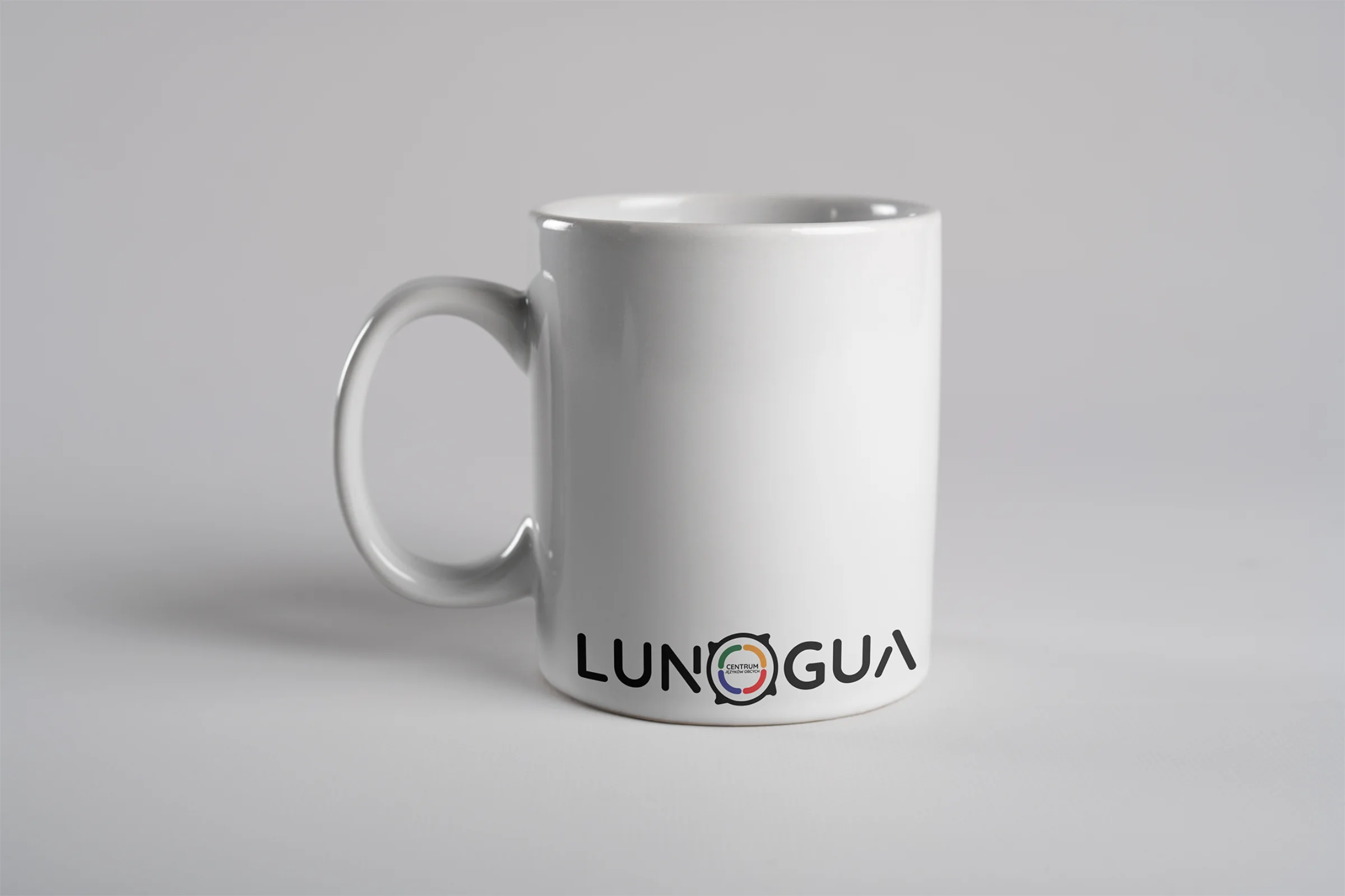
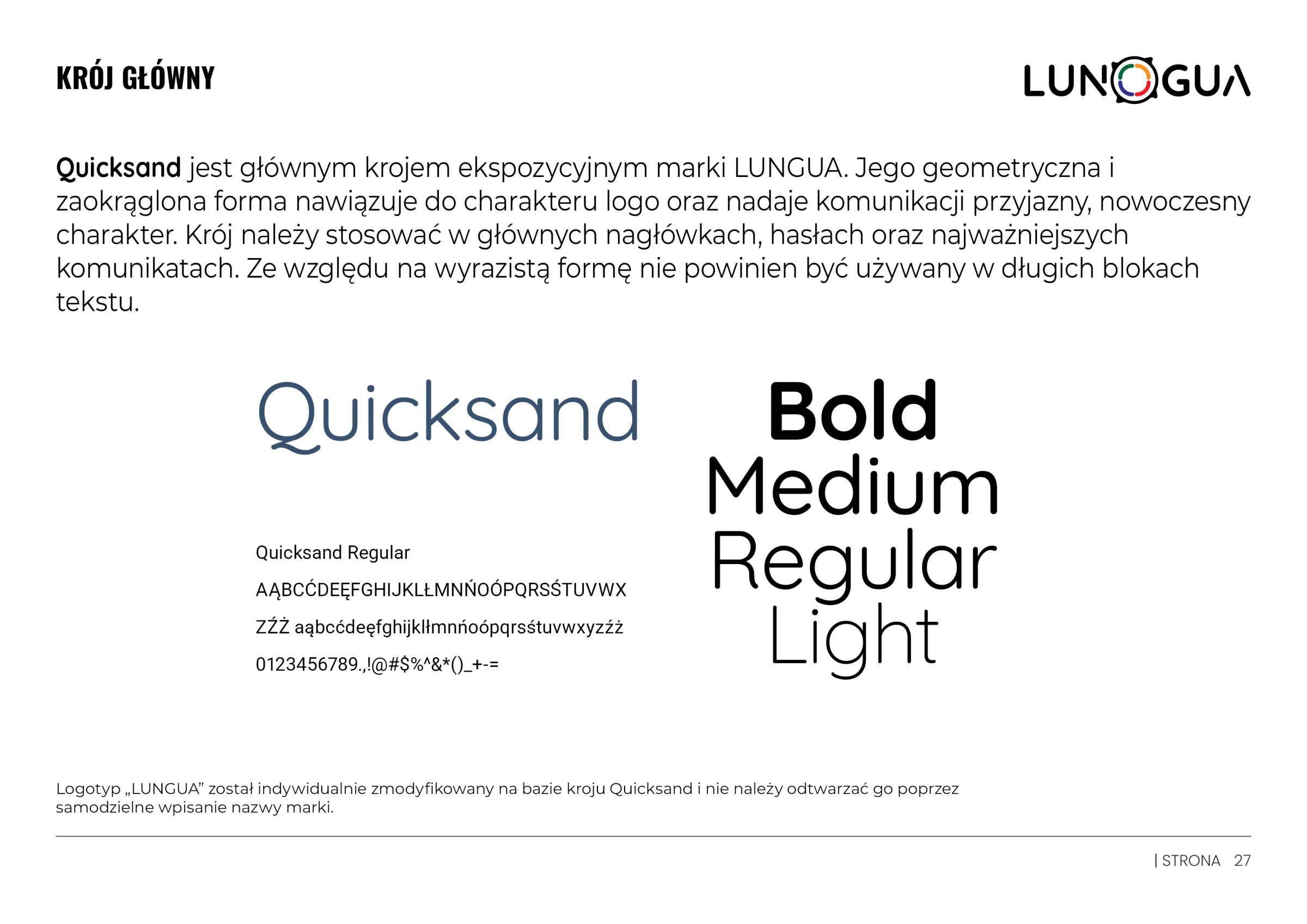
A logotype based on a modified Quicksand typeface and the simplified geometry of the symbol keep the mark legible from large-format banners down to a pen engraving (10 mm) and a favicon (40 px).
04 / Colour & typography
Energy and professionalism.
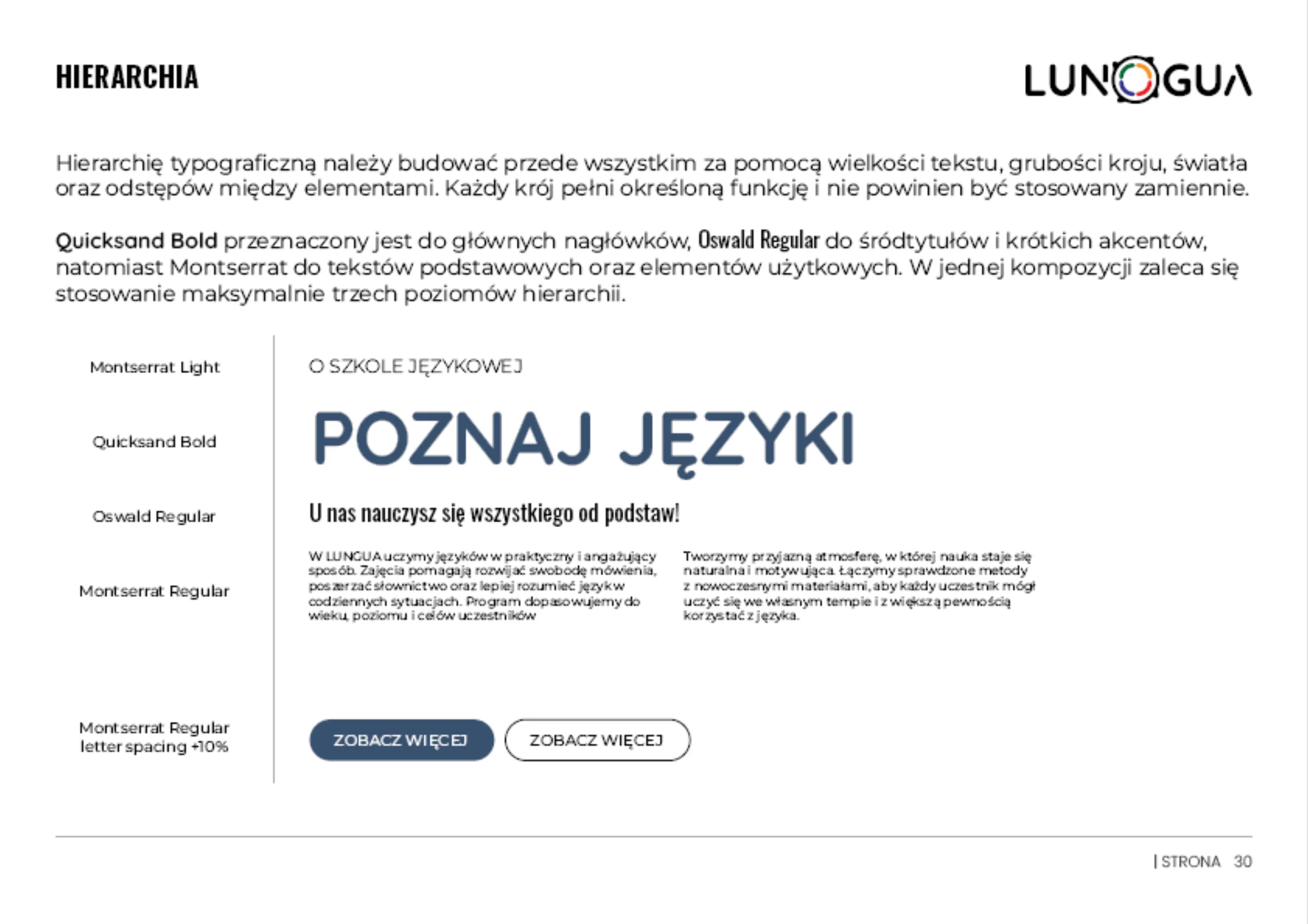
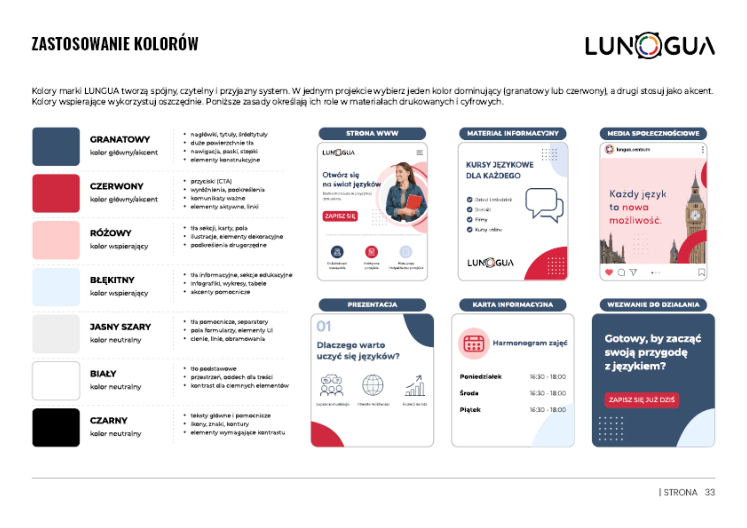
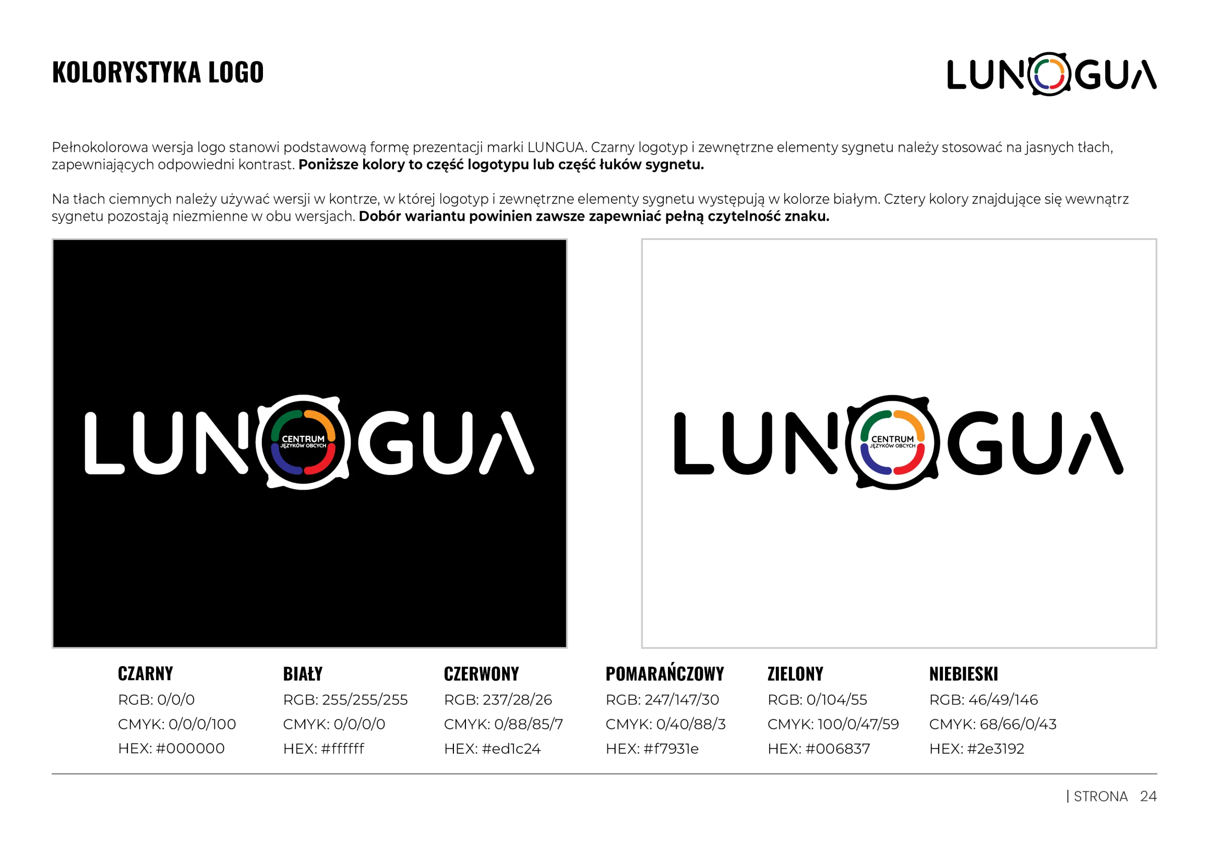
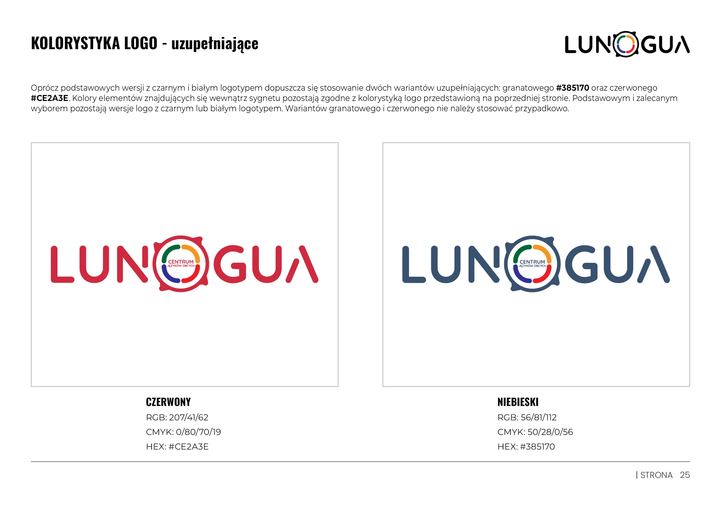
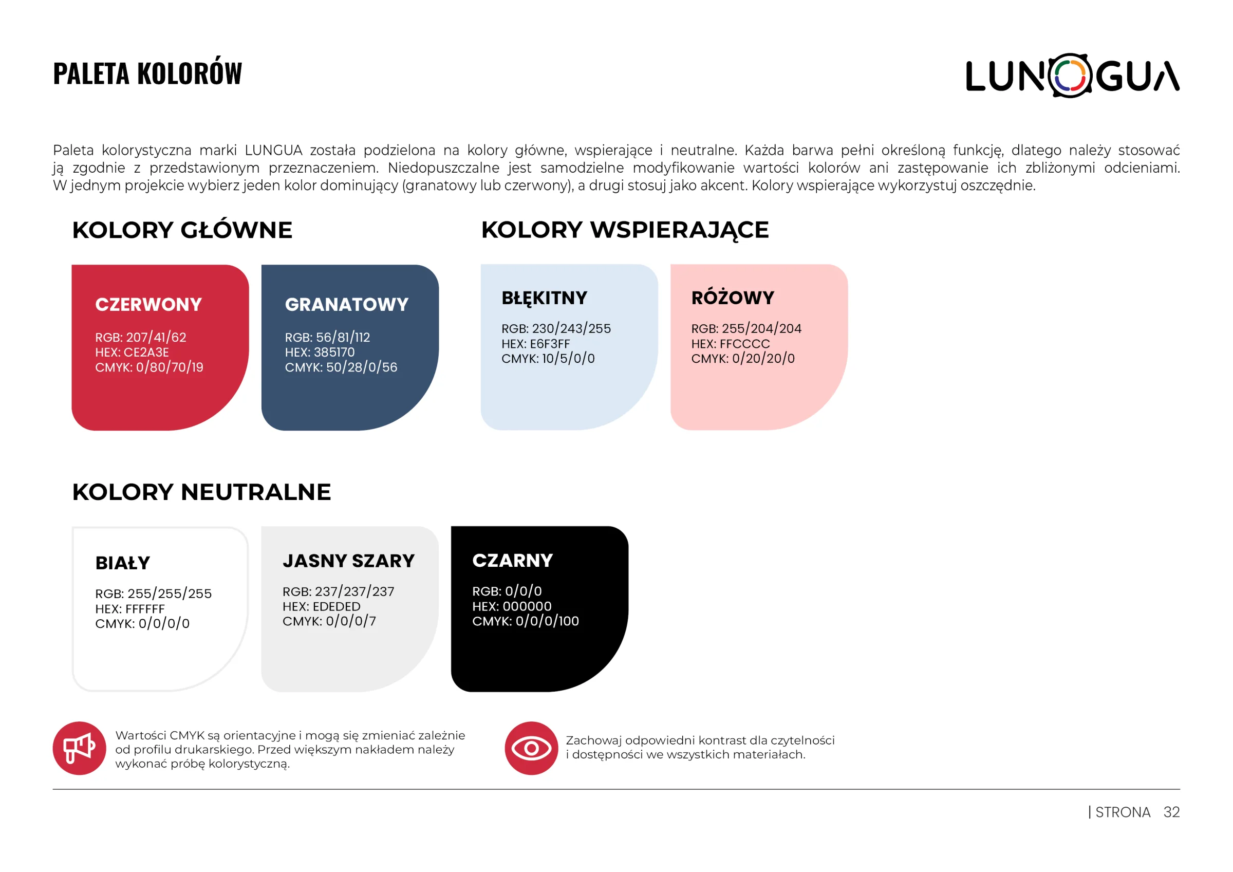
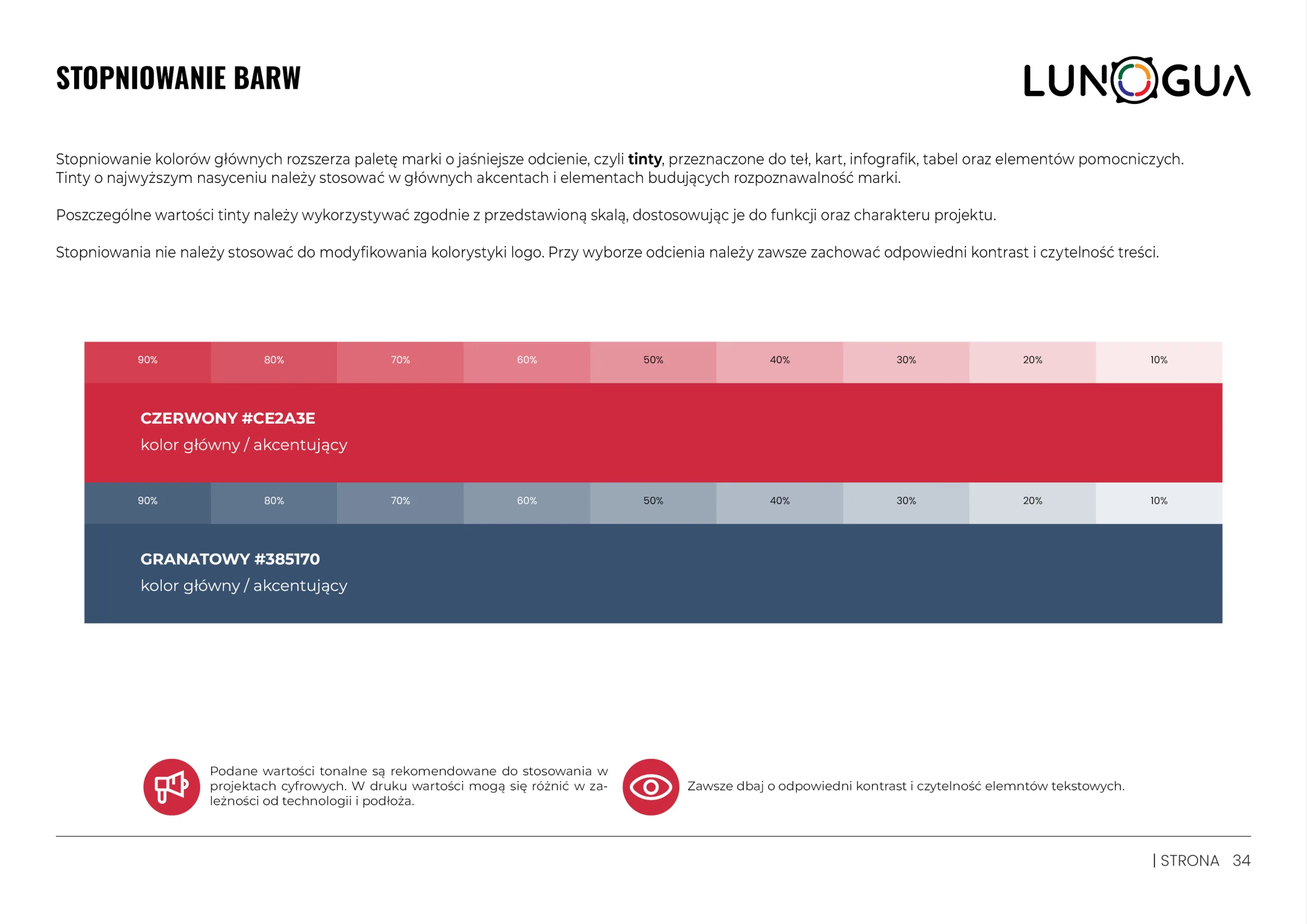
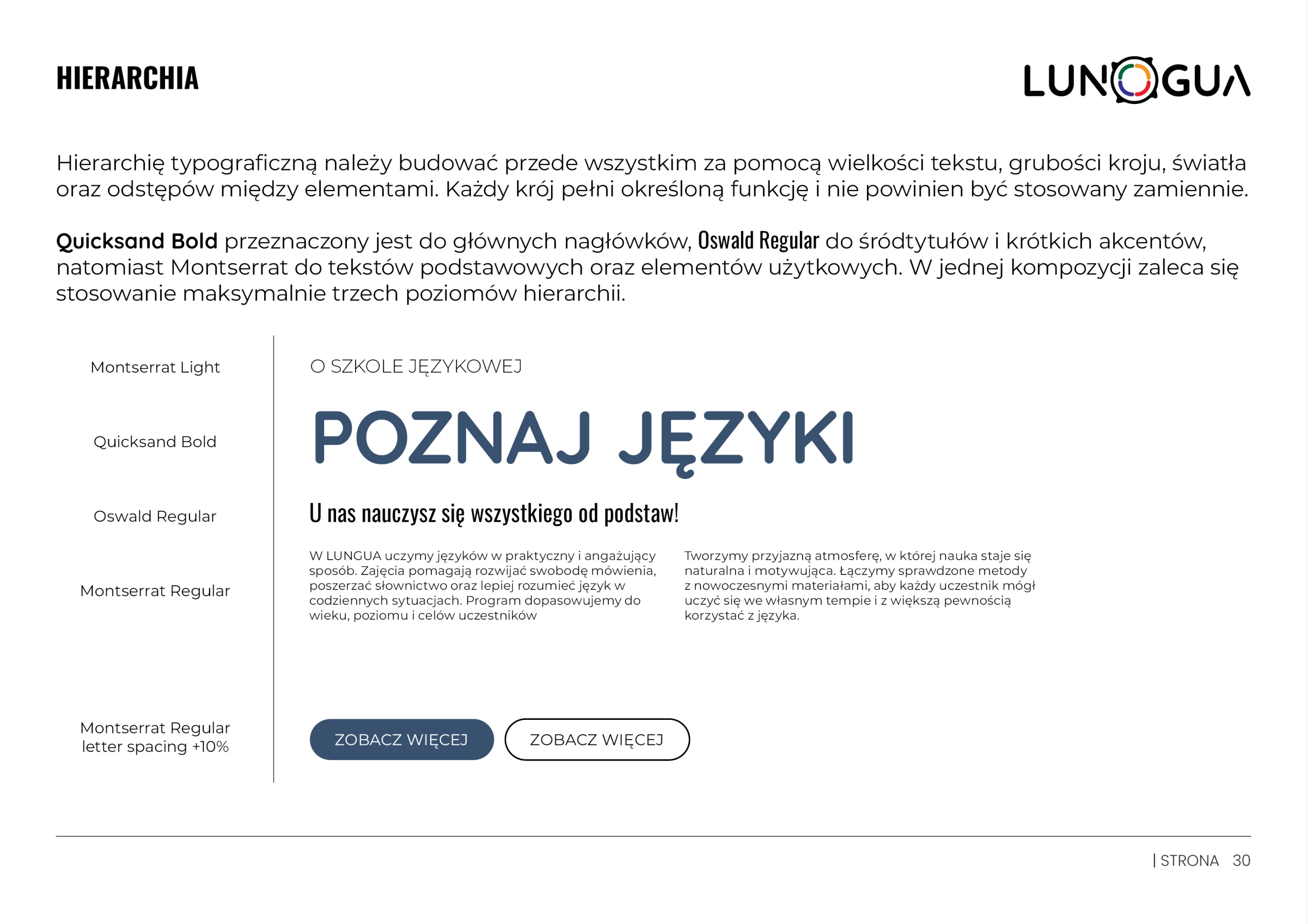
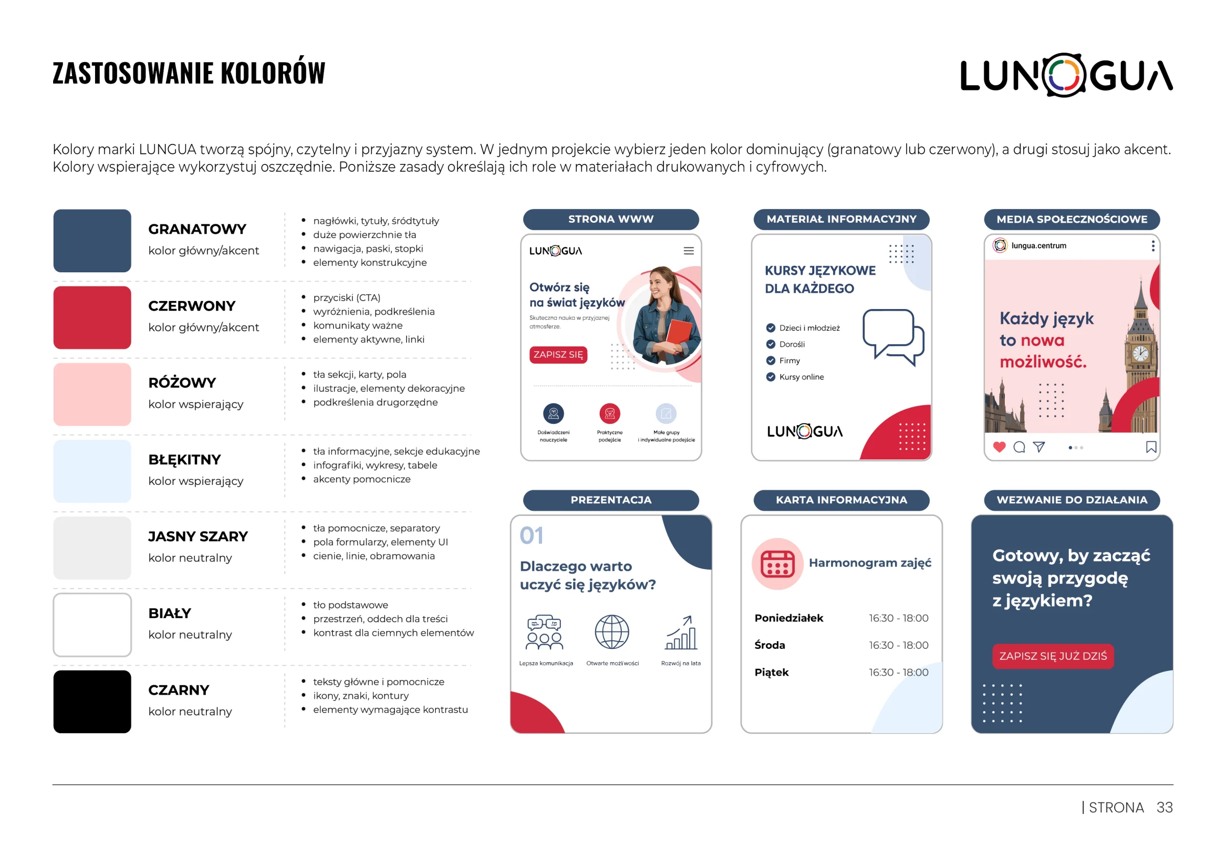
The palette pairs a deep, trustworthy navy (#385170) with a dynamic red (#CE2A3E), supported by a light blue and a pastel pink. A three-level type system (Quicksand, Montserrat, Oswald) organises the information hierarchy in print and digital.
05 / Key visual
A modular graphic language.
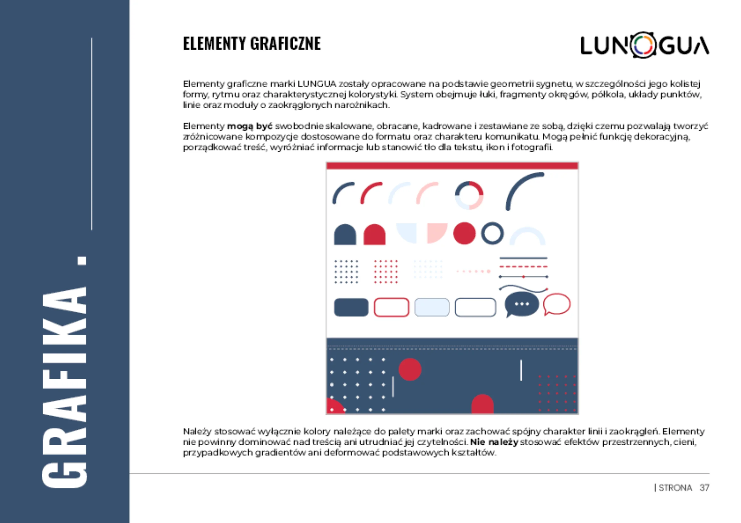
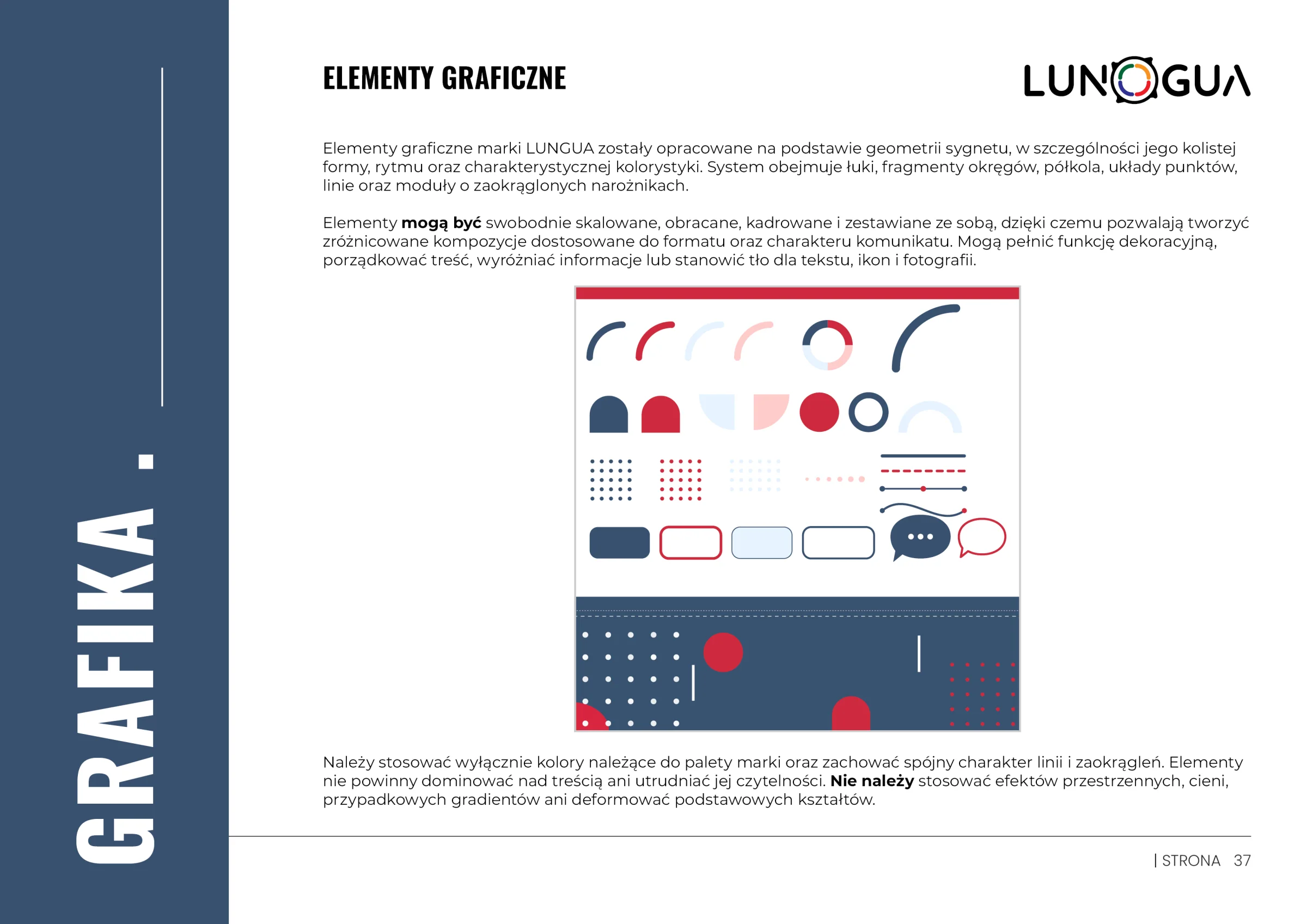
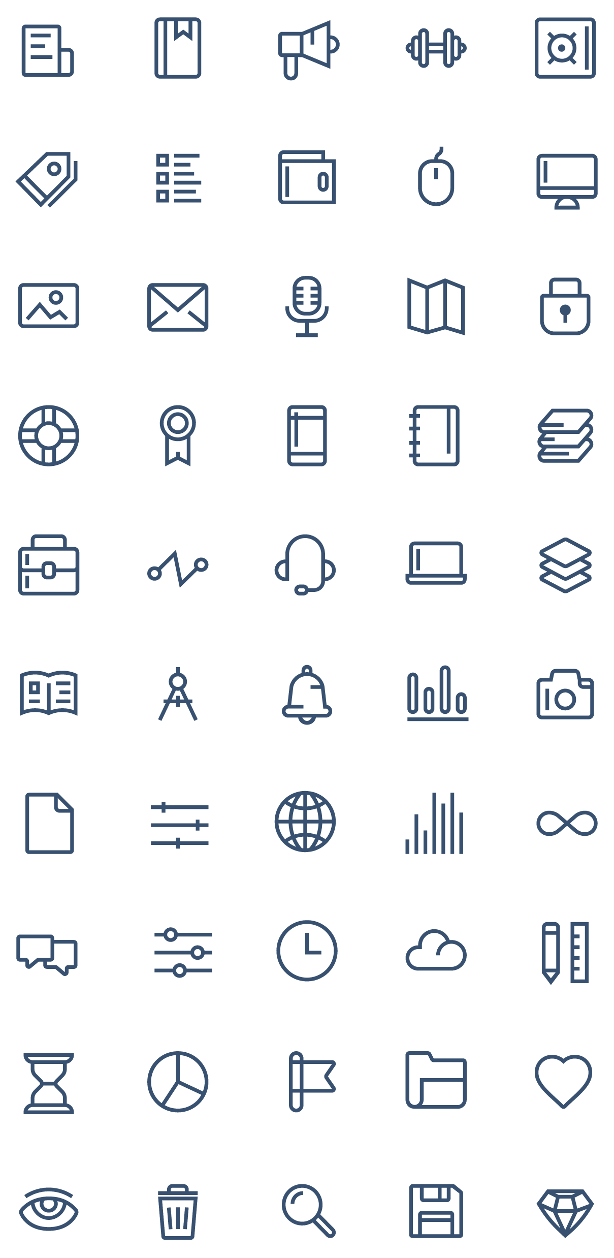
A flexible set of arcs, semicircles, dot grids and speech bubbles was derived from the geometry of the symbol, tying together every brand touchpoint.
06 / Rollout
The brand in motion.
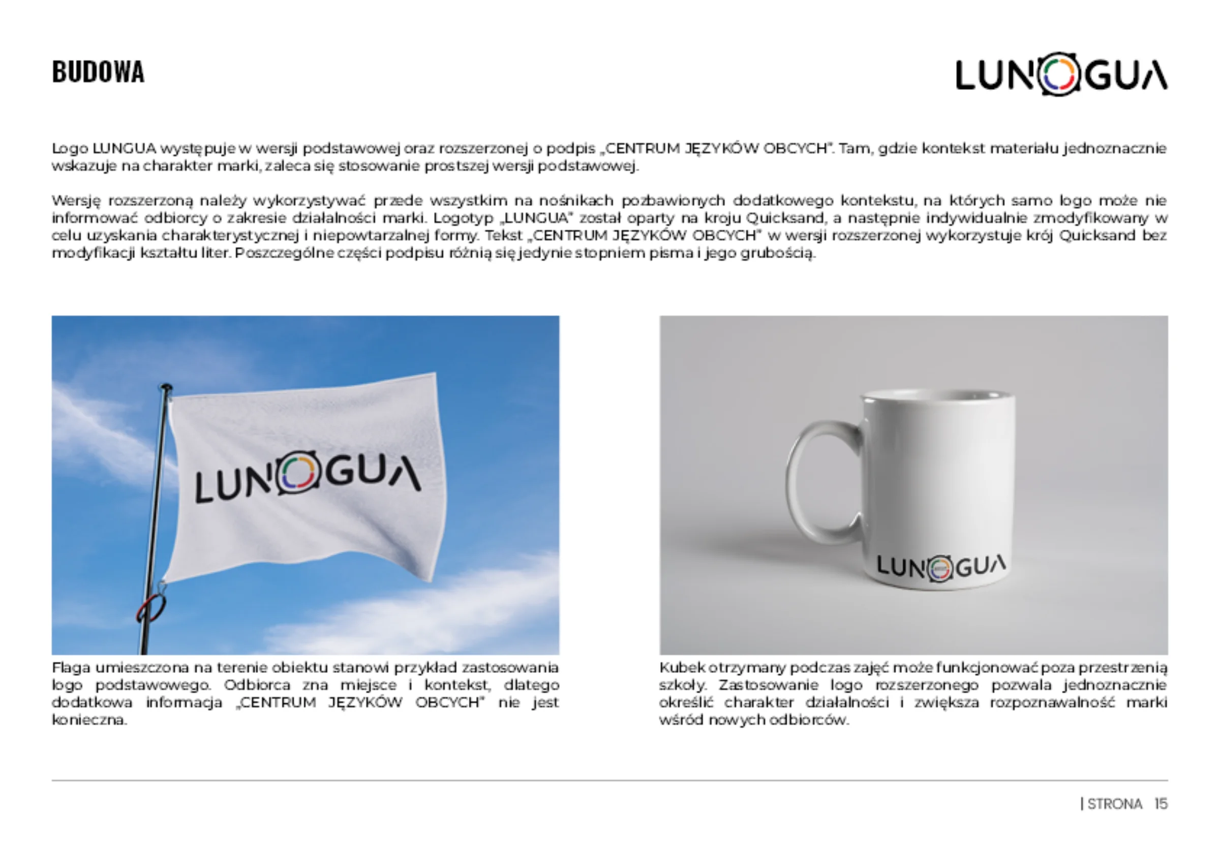
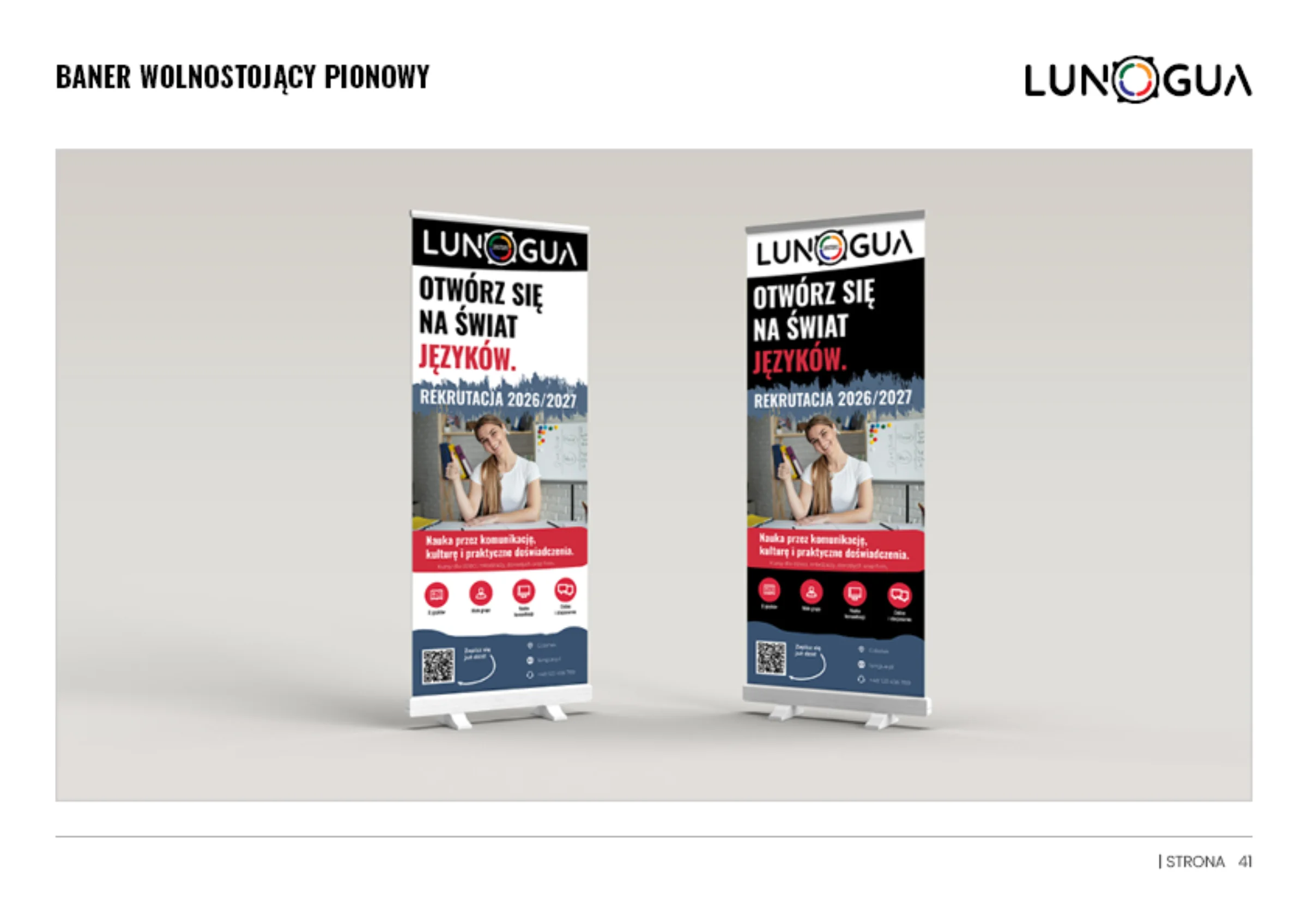
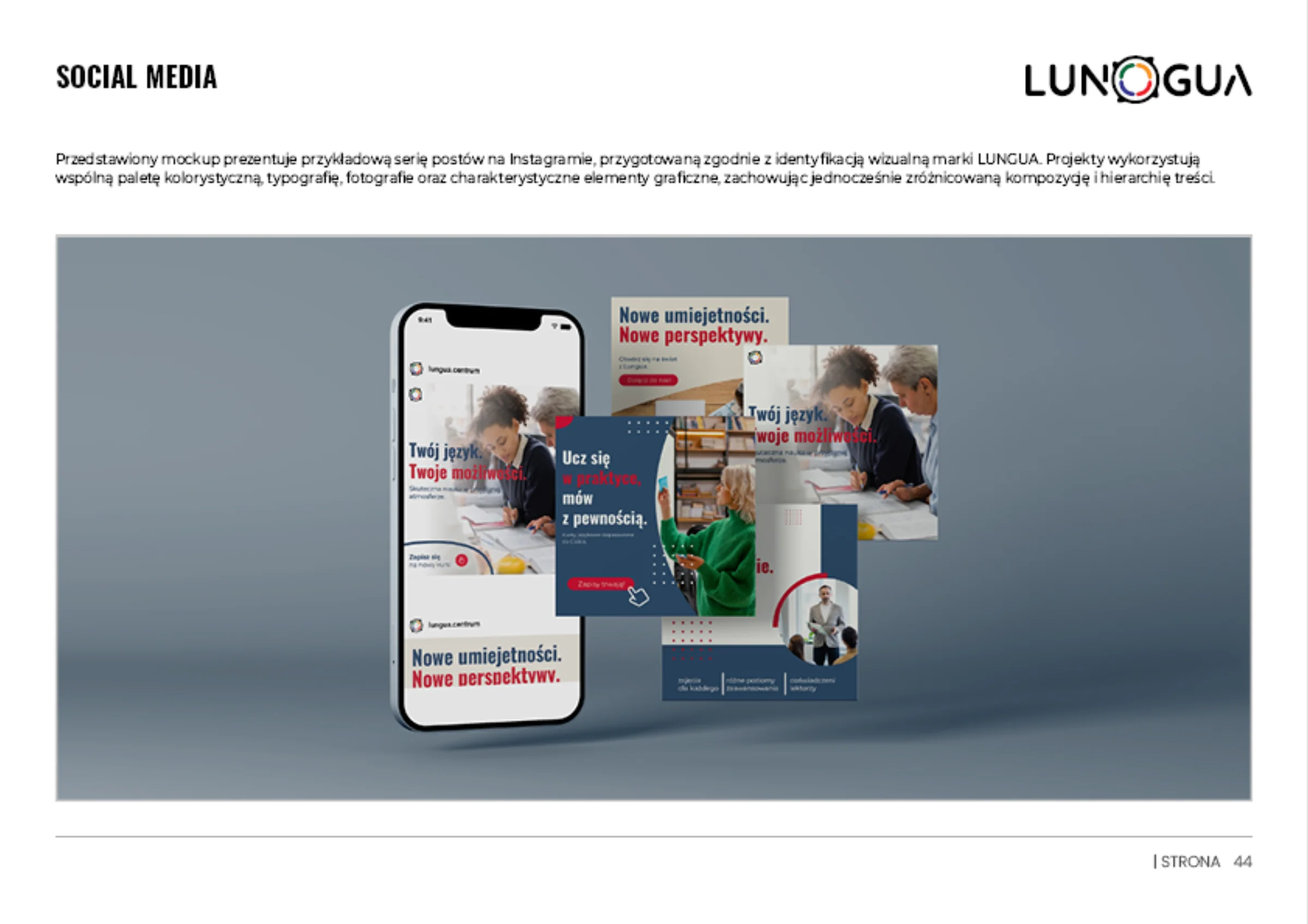
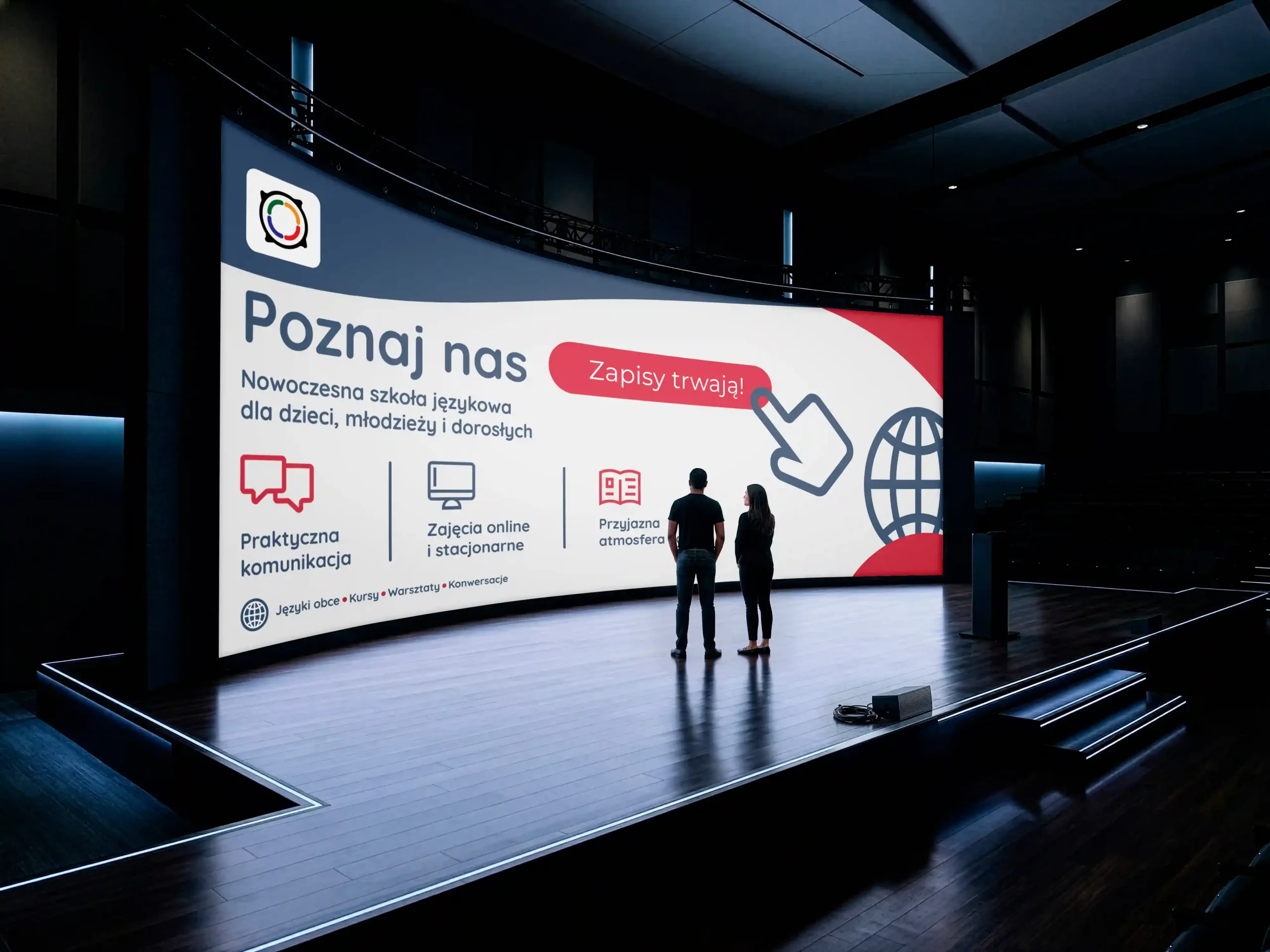
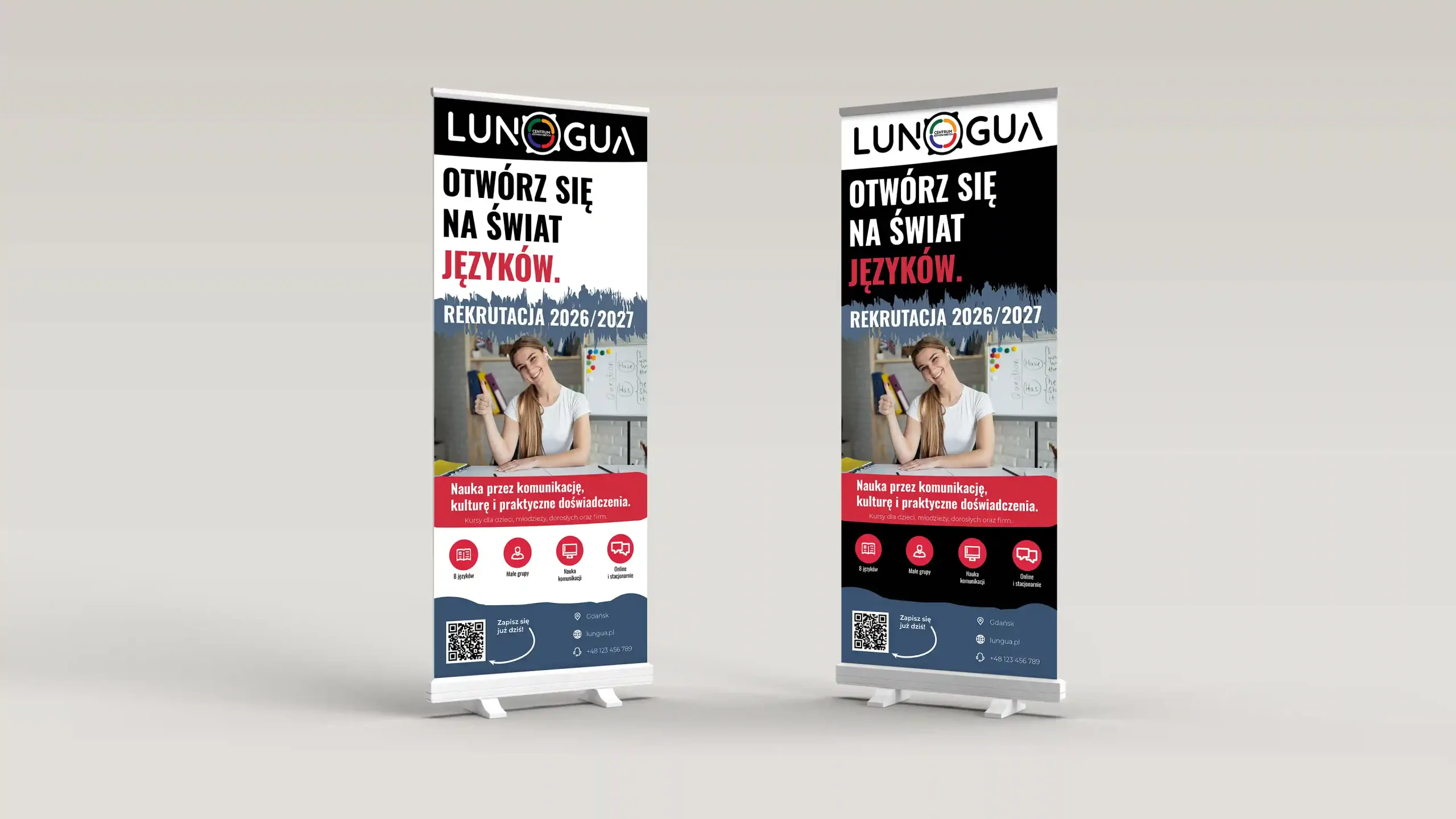
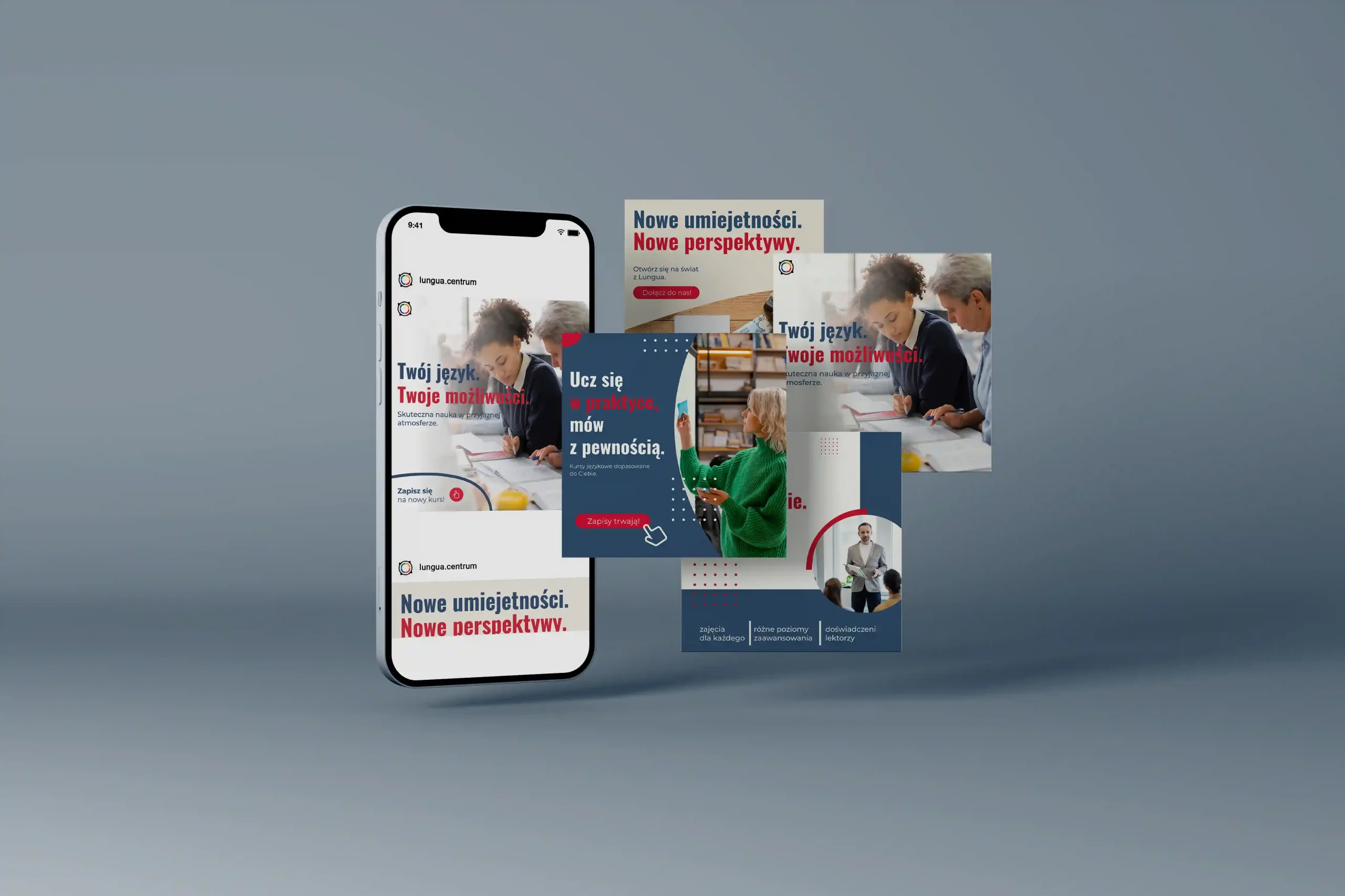
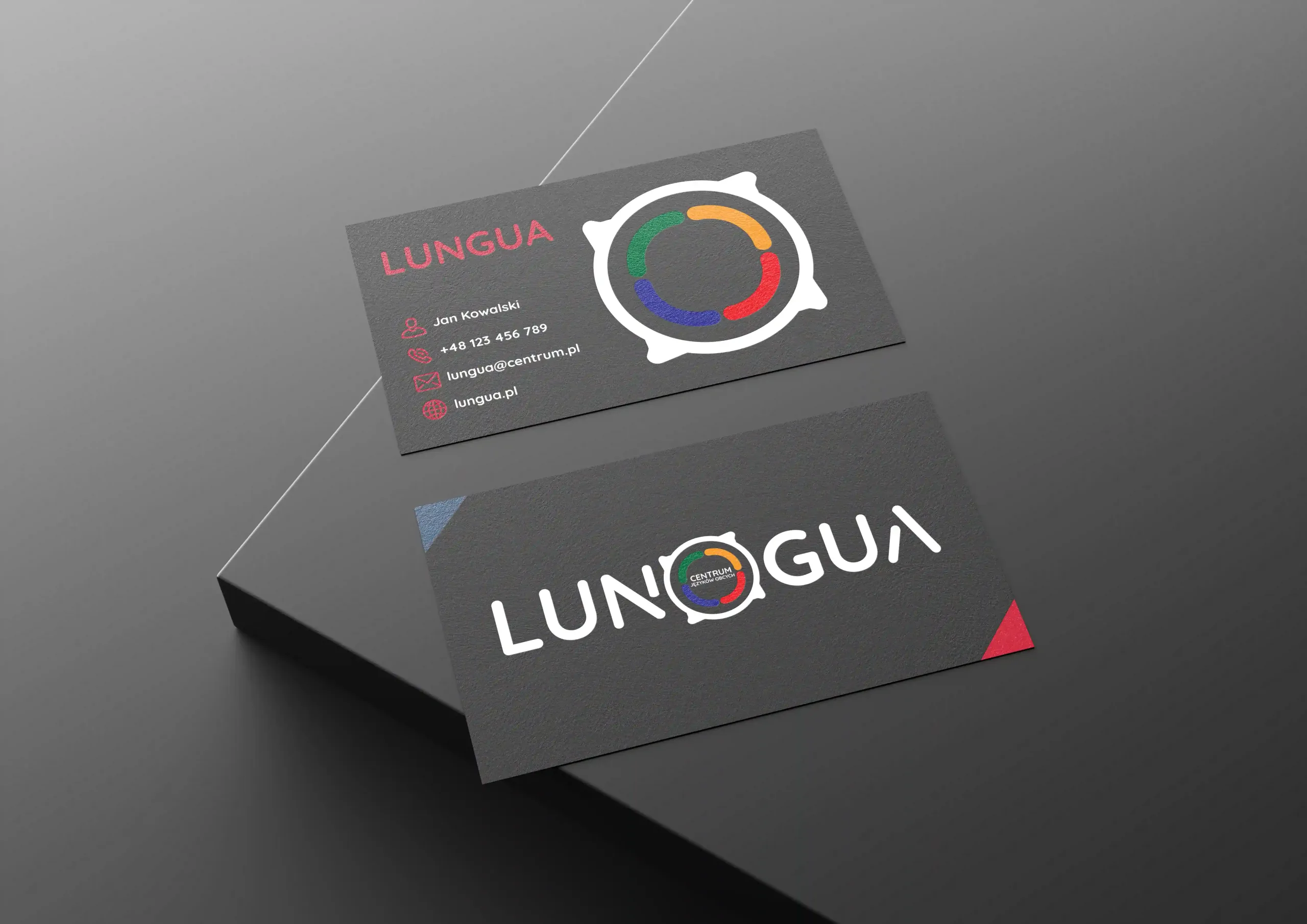
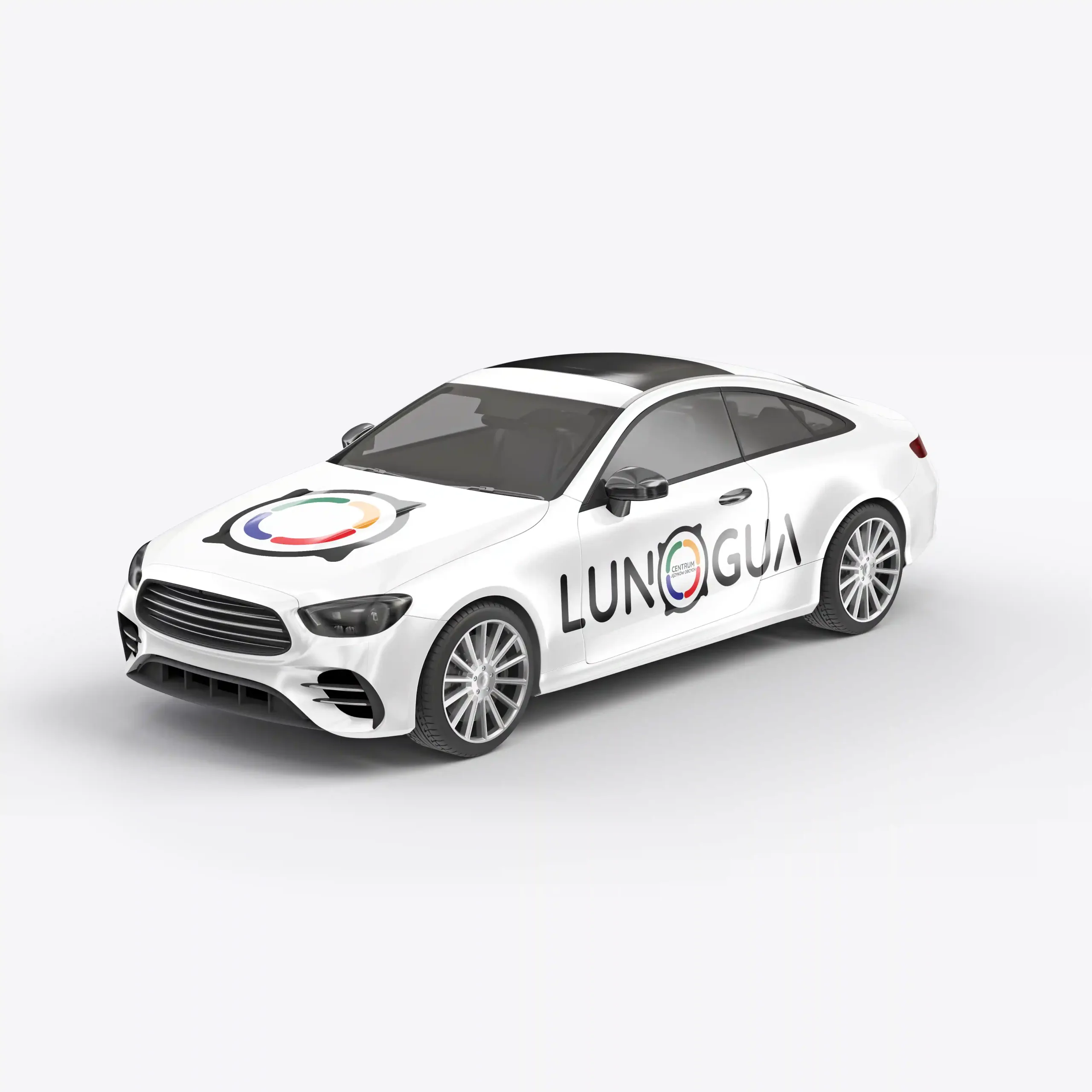
The identity system in practice – from public transport and event campaigns to Instagram templates and corporate materials.
07 / Logo book
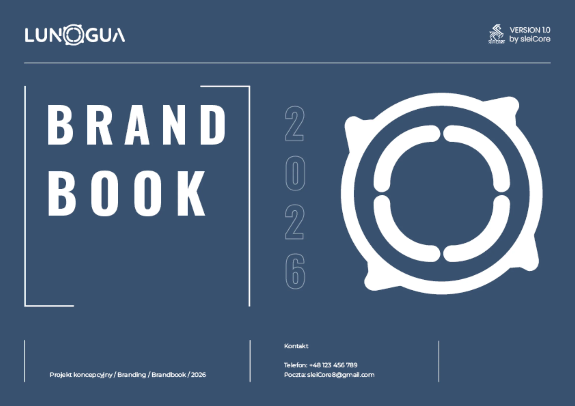
45 pages of rules, one consistent system.
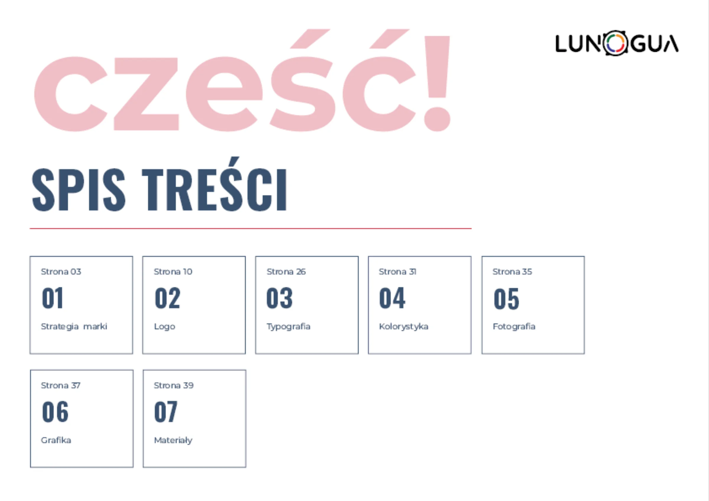
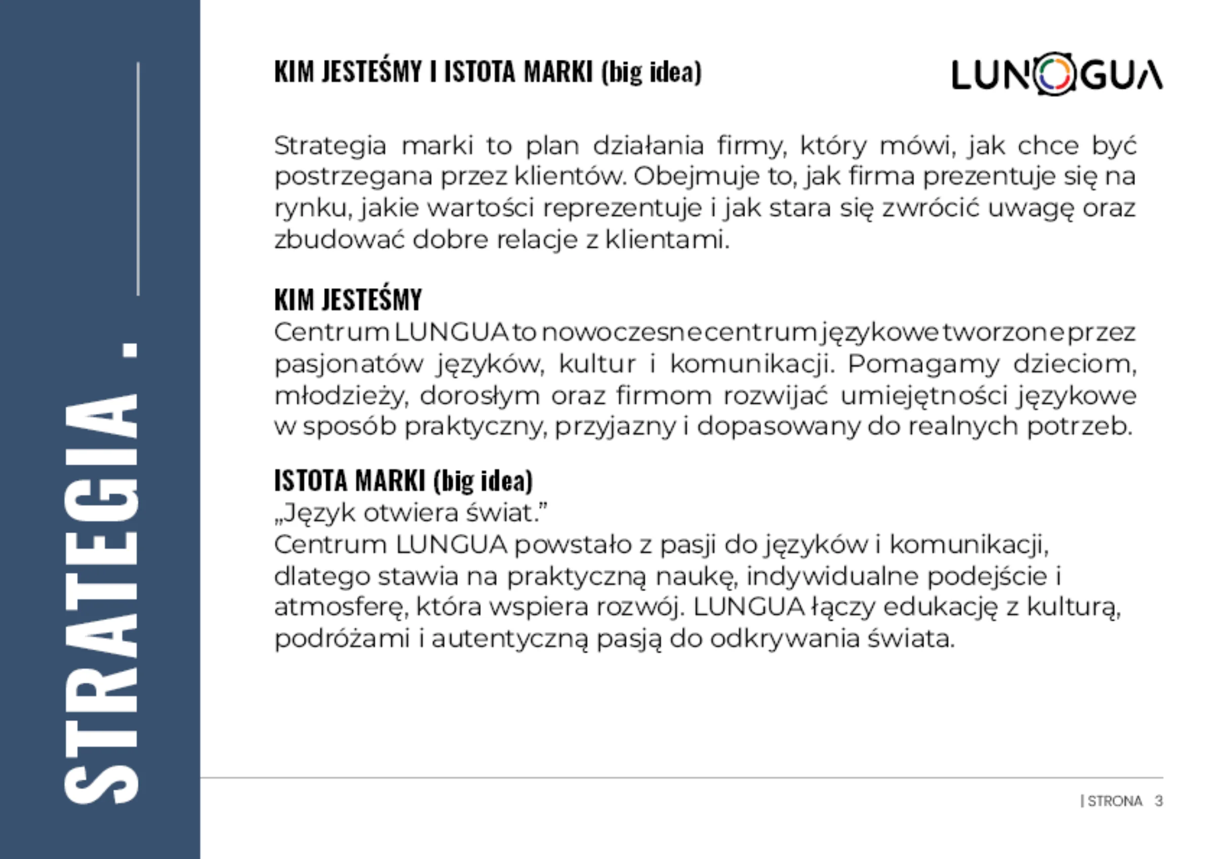
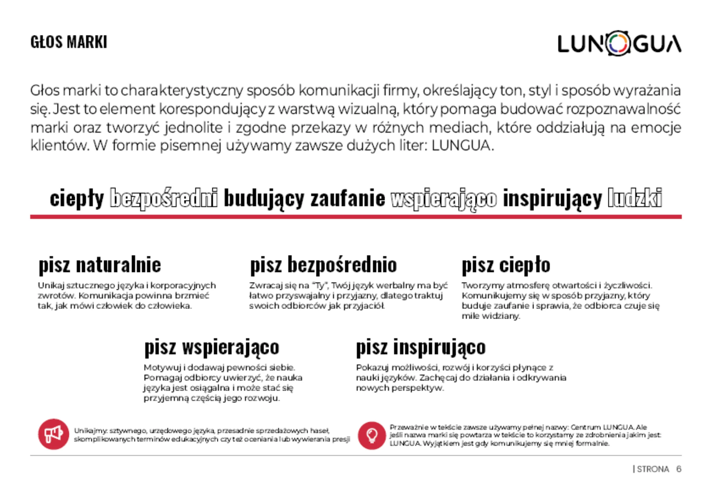
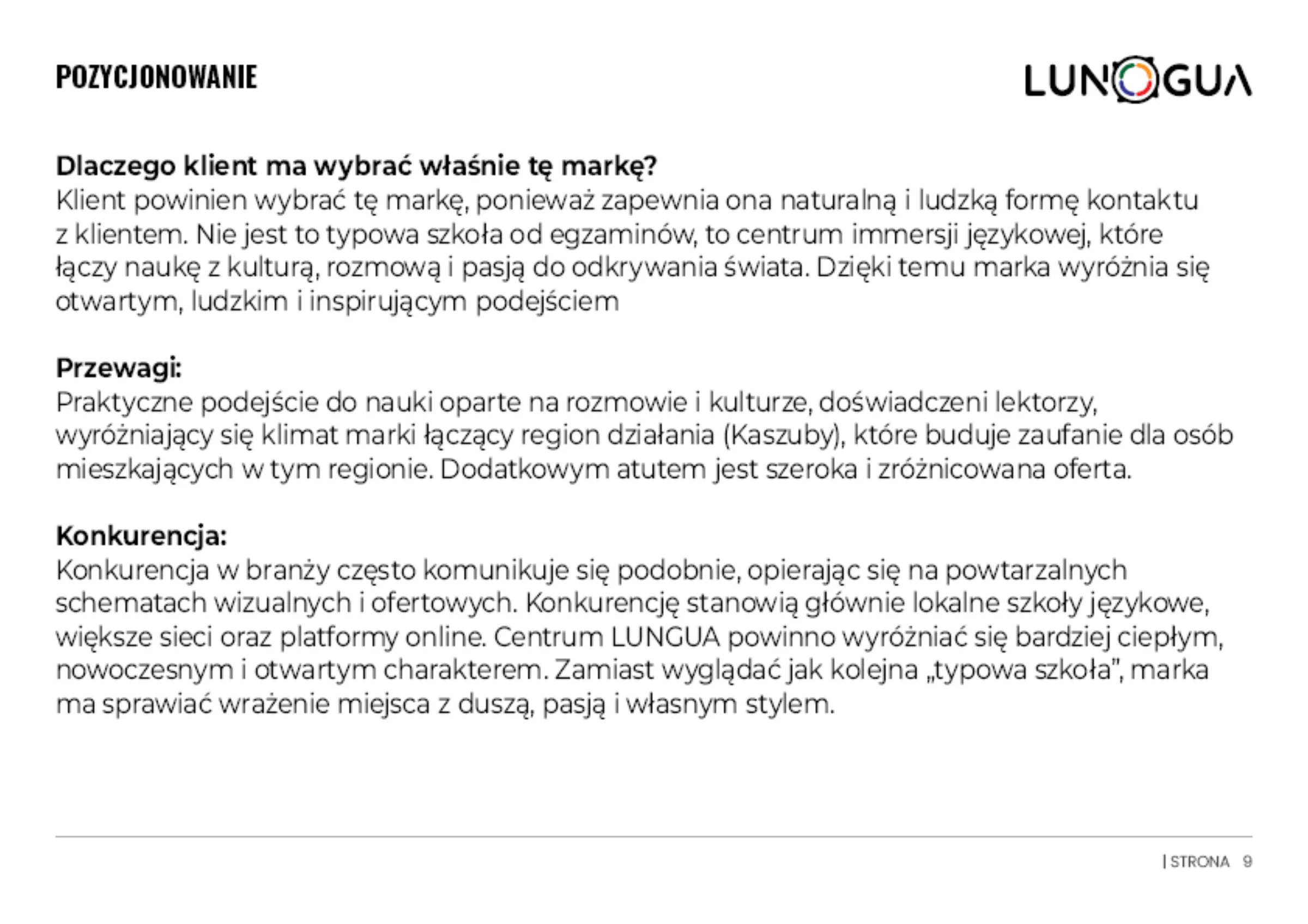
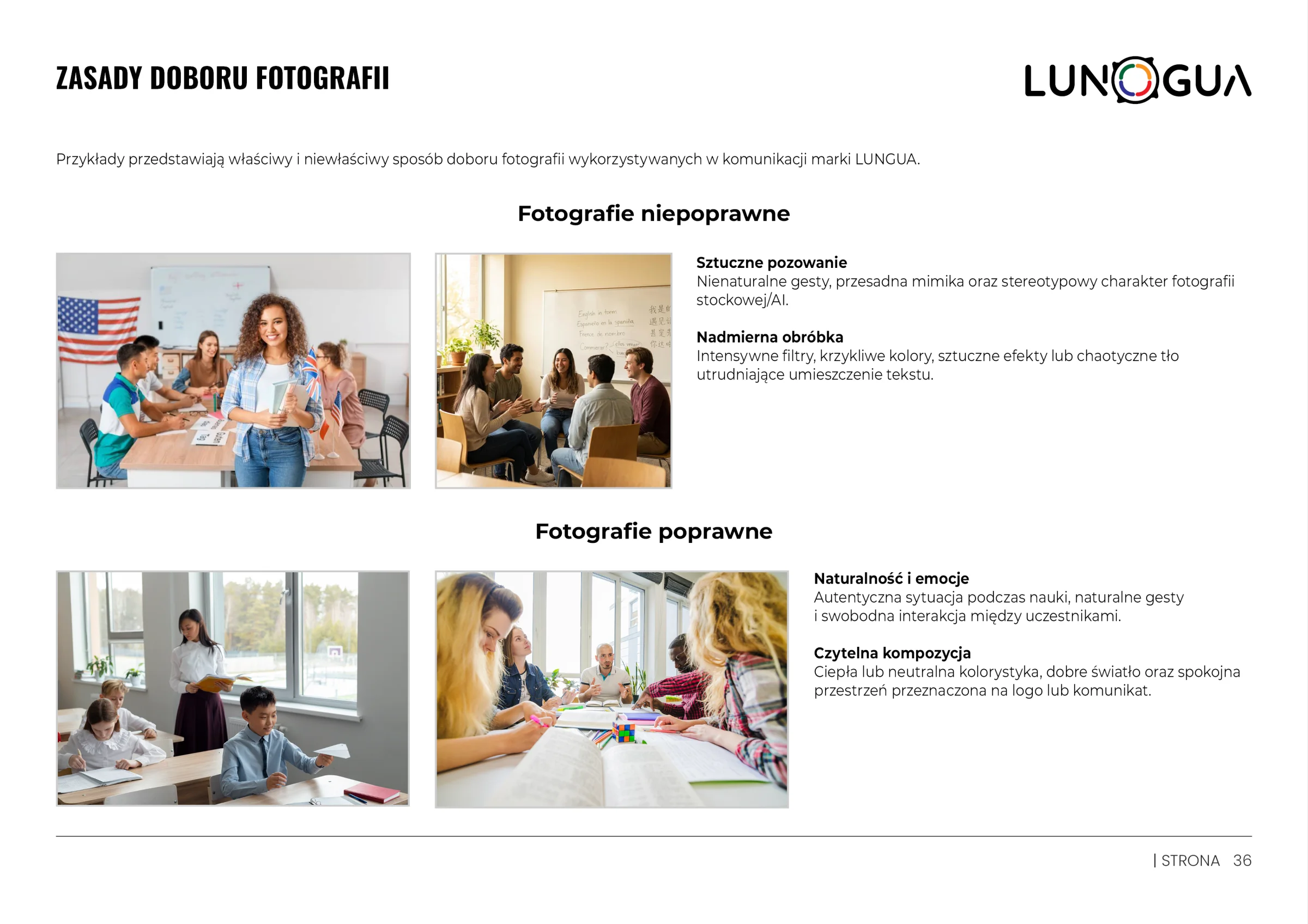
The logo book gathers the whole identity in one place: strategy and brand voice, logo construction, clear space, colours, typography, graphic elements, photography guidelines and rollout examples.